
Archive for the ‘dreams’ category
A Conversation with Daniel van der Velden of Metahaven

WD: Your work reveals both respect for and deep suspicion of the power of borders. Did that interest derive from your graphic design proclivities, or is design the medium through which you express long-held, deeply rooted philosophical insights?
DvdV: A border on a map is, literally, a graphic device. It is the line dividing two territories. I guess we have always been into borders because they do politically what graphic shapes do visually. Design is absolutely the medium to grapple with this kind of issue. Despite the fact that we live in a connected world of mobility — or maybe even because of it — the power of borders is increasing. Border protection is on the rise, not just geographically but also electronically. Our book Uncorporate Identity contains the example of European countries boasting colorful, Miro-styled tourist identities, while in African countries, these same countries broadcast shrill, dystopian video clips saying: “Don’t try to come here.” An open door for one person is a closed gate for another.
via http://observatory.designobserver.com/entry.html?entry=23688
Winterhouse Studio
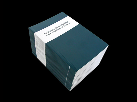
DvdV: From that afternoon in Brno I remember your own presentation, along with Jonathan Barnbrook’s and Linda van Deursen’s. After my presentation you immediately advised me to show less work — I think, an early warning of our differences: your preference for clarity and simplicity, and mine for avalanche, at the time maybe even much more so than now. Your talk showed how you have always been compelled to do design yet are driven and inspired by non-design topics that ranged from poetry to politics. I feel related to that idea and familiar with its problems. I’d say, however, that is what design is essentially about. Design is about the world, other people, other things, via you the designer, the gatekeeper. You are the filter. In my view, one of the most intriguing books you designed is the National Security Strategy of the United States, created after September 11. This was a book you sent to me straight after we had first met in Brno. I think of it as a document with historical value.
WD: When I published the National Security Strategy of the United States in 2002, it was the act of a frustrated citizen who had the tools of graphic design and publishing in his hands. The New York Times had only published excerpts of this new U.S. policy, but it was immediately clear that this document, freely available on the White House website, foretold the future — America would engage in a war on terrorism on its own terms, without regard to international law or the Geneva Conventions. (The torture at Abu Ghraib was clearly foreshadowed here.) To publish it only 48 hours after the new policy was released (of course, after fixing a few typos in the original document) was the real accomplishment: making it a book moved it beyond recent news into another, more permanent zone. Ironically, it is the least interesting design we have ever created, but perhaps the most influential book we have ever published — it sold 20,000 copies the next year, all through private distribution. Looking back, I believe this was the first time I used my role as a graphic designer and publisher to further purely personal political goals, and with no client agenda or backing. This was not design research or a designer-as-author endeavor — this was simply an act of political outrage. The design was in the act, not the execution. I’d like to believe that publishing this blight on American values had an impact, but it was solid journalism (by writers such as Mark Danner, to name just one) that would ultimately tell the real story of this misguided U.S. policy.


Lars Muller lecture at AA Schol of Architecture
http://www.aaschool.ac.uk//VIDEO/lecture.php?ID=1201
Lars Müller
Communicating Architecture
Date: 02.03.2010
Time: 18:00:00
Running time: 90 mins
Editorial conditions and design rules have changed now that the book shares its formerly unique media position with new and challenging offers by digital media. The lecture will introduce the potentials of the book as a medium for the communication of architecture and will analyse the structural and functional differences between analogue and digital media and their abilities and limits in the expression and communication of architectural atmosphere.
Lars Müller is founder of Lars Müller Publishers (lars-mueller-publishers.com), best known for its editions of design, art, photography and architecture that have set standards in architecture publishing. Recently, the company has expanded its catalogue, bringing the same rigour and attention to social and political books as it brings to books in the creative field. Müller, an active educator since 1985, is teaching a course on Communicating Architecture at Harvard’s GSD.
Michiel Schuurman
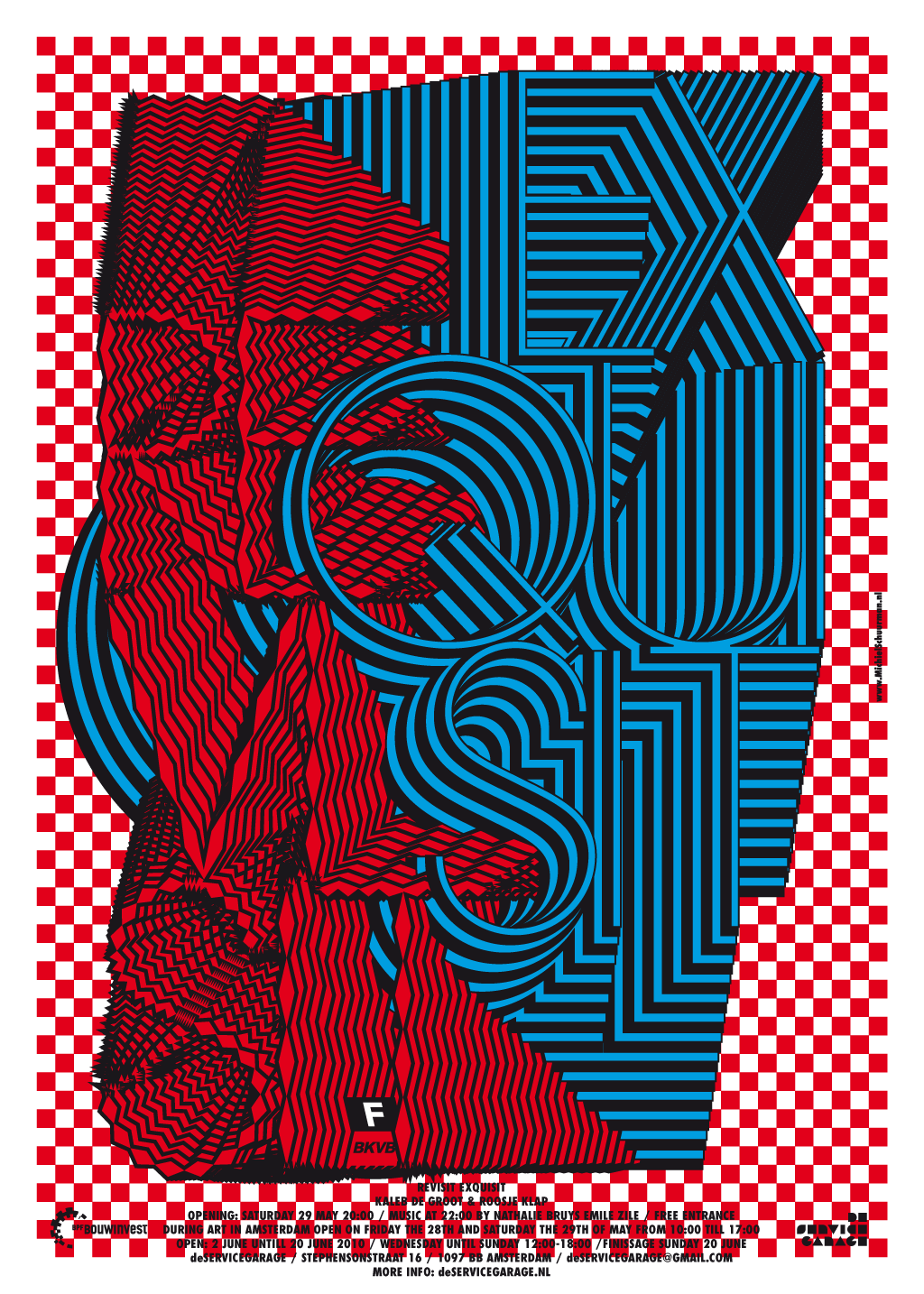
Michiel (Amsterdam 1974) studied graphic design and typography for two years on the Koninklijke Academie voor de Beeldende Kunsten Den Haag and graduated as graphic designer in 2002 on the Gerrit Rietveld Academy Amsterdam.
His work is almost always about altering typography to the point where it fully replaces image. The sometimes psychedelic designs are strongly based on classic typographic laws and high contrasts of patterns and colors.
Expansion & Collapse
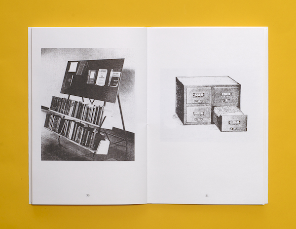
Expansion & Collapse is an ongoing collaborative project between Fay Nicolson and Oliver Smith exploring processes of acquiring, organising and displaying visual research. Within this project we trace relationships between traditional sites for storing information (libraries, archives and shelving systems) and new digital, networked and compressed sites for accessing ‘knowledge’- making connections between schematic and architectural, real and hypothetical spaces.
K+W shirt
You are viewing a genuine shirt with our W+K logo changed to K+W on it, per David Kennedy’s instructions. While it’s almost certainly too late for such emendations to have any effect, that’s not really what the shirt is about. designed by: David Kennedy 
Emily Pilloton: Teaching design for change
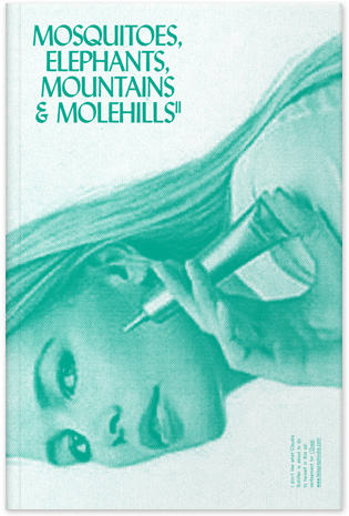
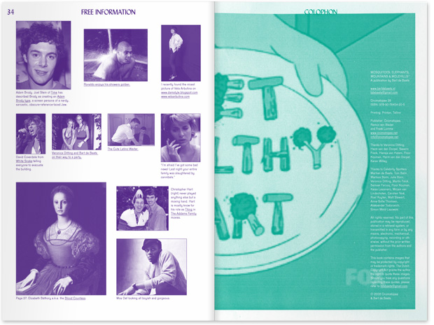
Mosquitoes, Elephants, Mountains & Molehills,
PRESS RELEASE — Mosquitoes, Elephants, Mountains & Molehills, a publication by Bart de Baets, published by Onomatopee
In the second issue of Mosquitoes, Elephants, Mountains & Molehills Bart de Baets continues to bombard us with his fascination for trivial information. It’s a collection of casually written short stories, observations, lists and rumors, starring family, friends and lovers, the dead and the living, the gorgeous and the not so gorgeous. And though it’s hard to tell the difference between what’s fiction and what’s fact, it’s clear the author is not afraid to share his private life and his fascination for what is known as ‘bad taste’. Although the content sometimes seems shallow, unimportant almost, it reads as if one is peeping into another person’s diary. Don’t we all just crave for gossip in the end?
Parts of this issue of Mosquitoes, Elephants, Mountains & Molehills have been published before in fanzines made by the artist, and are edited and re-used in this publication. Recycling older material is a remarkable feature of de Baets’s work. It exaggerates both the importance and the insignificance of the content. Just as in the first issue of Mosquitoes, Elephants, Mountains & Molehills, it is important for him to force the viewers to enjoy the banality of the so preciously collected footage.
Sulki & Min: The Power of Color
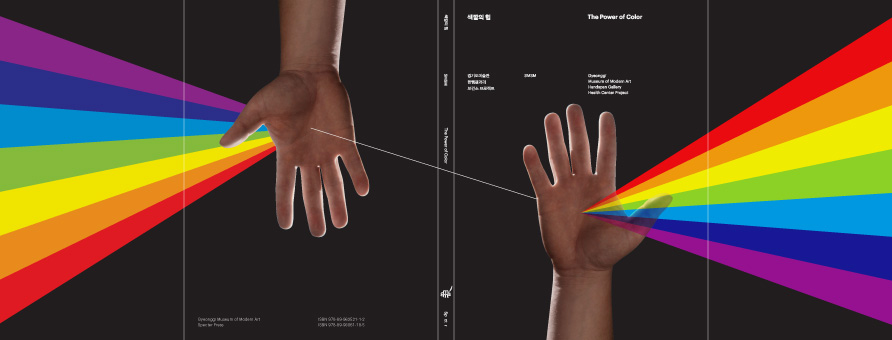
Book published to document The Power of Color, the Gyeonggi Museum of Modern Art Handspan Gallery Health Center Project, Ansan: Gyeonggi Museum of Modern Art & Seoul: Specter Press, 2009. Flapped paperback, 180 x 240 mm, 144 pp. This book was made as part of the first realized work of the collective SMSM: Sasa [44], MeeNa Park, and Sulki & Min. See also the mural and the booklet.
The Health Center Project, which was inspired by the ‘color therapy’ theory of Dr. Morton Walker, is documented in the first 32 pages with essays by Hong-hee Kim, Geun-jun Lim and Kyung-hwan Yeo. The rest of the book is made simply of different kinds of colored paper, with no information except brief quotations from Dr. Walker’s book The Power of Color (1991) on alleged physiological effects of each color. The cover pays homage to both Dr. Walker’s book and Pink Floyd’s The Dark Side of the Moon (1973). Do not ask why – we just want to believe.
VosBrenner

VosBrenner is a design studio located in Rotterdam founded by Nele Vos (GER) and Michael Brenner (USA). Their work primarily focuses on Environmental, books and publications, information architecture and identity. We particularly enjoy developing these projects with clients in the cultural and educational fields.
Research is key in our investigations when approaching a communication problem. Often in this process we try to de- and re-contextualize ideas to to create inspiring and unexpected results. Always conscious about a projects historical and cultural reference as a starting point for a new vocabulary including it’s media.
We Want to Believe —
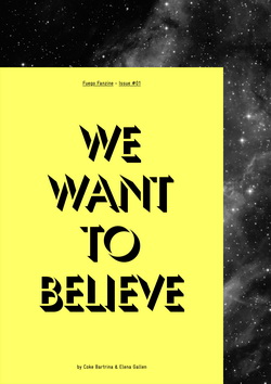
The birth of Fuego, issue one, gets off to an unabashedly self-referential start. For example, one of the projects in this, the I Want To Believe issue, takes the fact that one of the maker’s fathers worked on an experimental 8mm movie about UFO’s in the 1970’s as a prompt to make their own photos of faked UFO’s. This kind of re-enactment – and yes, it’s not outside of the realms of certain contemporary art practices- produces a series of photos that at once resonate on numerous levels. Perhaps the most lucid of these is just how familiar fake UFO photos now are in the collective consciousness. Perhaps more poetically, they capture the tension that many of us feel between knowing that they are fakes – as taught to us by hundreds of television programmes- and wanting to believe in some other form of life out there. Referencing the cult 1990’s X-Files series’ catchphrase, this tension between belief and empirical knowledge seems to be the main theme present in the issue. Carefully realised with an aesthetic that entirely denies the Photoshop and After Effects filters that now permeate everything from mainstream Sci-Fi films to sneaker adverts, this is a precise meditation on the topic.
2011 Typographic Wall Calendar
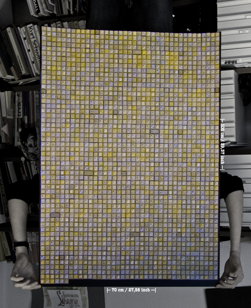
The 2011 Typographic Wall Calendar is a project to construct a large calendar from 2011 keyboard keys. The keys are arranged manually in a grid. If you read them, they read each day of the year in sequence: January Sat 01 Sun 02 Mon 03 etc. http://www.kickstarter.com/projects/107717342/2011-typographic-wall-calendar
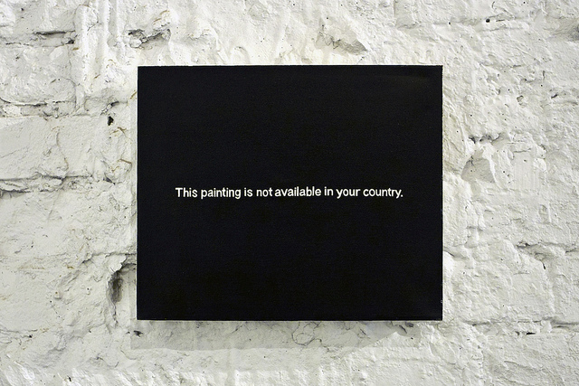
This painting is not available in your country (2010) - Paul Mutant
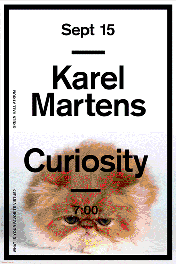
Karel Martens Vs. Marcel Proust
To announce Karel Marten’s lecture at the Yale School of Art I asked Karel to respond to the Proust Questionnaire. Collaborating with Inva Cota and Jaewon Seok, we created a modular, 28 part ‘performance’ poster that would be updated every 2 hours with a new answer from the questionnaire.
Publications / Peep-Hole Sheet
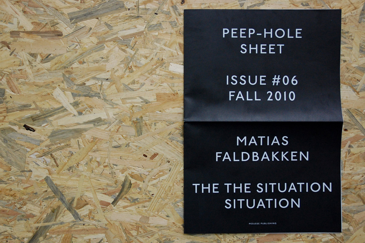
Peep-Hole Sheet is a quarterly of writings by artists.
Each issue is dedicated solely to one artist, who is invited to contribute with an unpublished text whose content is completely free in terms both of subject and format.
The texts are published in their original language, with accompanying translations in English and Italian. All images are deliberately avoided. Peep-Hole Sheet is meant for those who believe artists are catalysts for ideas all around us, and who want to read their words without any filter.
Over time it aspires to build up an anthology of writings that might open new perspectives for interpreting and understanding our times.
Misha Shyukin
ensa from Misha Shyukin on Vimeo.
The online portfolio and some kind of digital sketch-
book of Misha Shyukin. He is 23. Studying design in Germany. He does like cats, dusty cameras and videos.
Copyright © _dreams. All rights reserved.