
Archive for the ‘dreams’ category
Steve Jobs’ 2005 Stanford Commencement Address
November 18th, 2008
I know this is kinda old, but i think its value is timeless. It kind of applies to some of us now.
Keep looking, don’t settle.
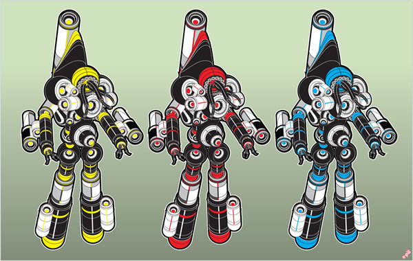
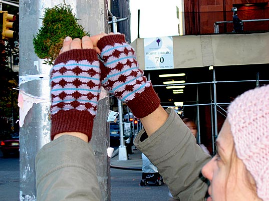
Shanghai Watch
November 18th, 2008
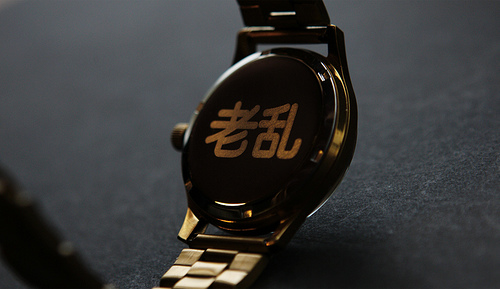
Set up in 1955, the Shanghai Watch Factory has produced over 120 million watches, which have been worn by luminaries such as Mao Zedong, Deng Xiaoping and Zhou Enlai. With Wieden + Kennedy Shanghai and multi-discipline creative practice Jellymon, it has produced 5 fresh designs, adding bold silver and gold and a modern Chinese attitude to a watch that has been resurrected from the archives. On the back of the watch you’ll find the Chinese characters 老乱 (Pronounced “Lao Leow”) which translate literally in Mandarin as “Old Disorder” and Shanghainese slang roughly as “Fucking Cool”.
Art with Sound
November 17th, 2008
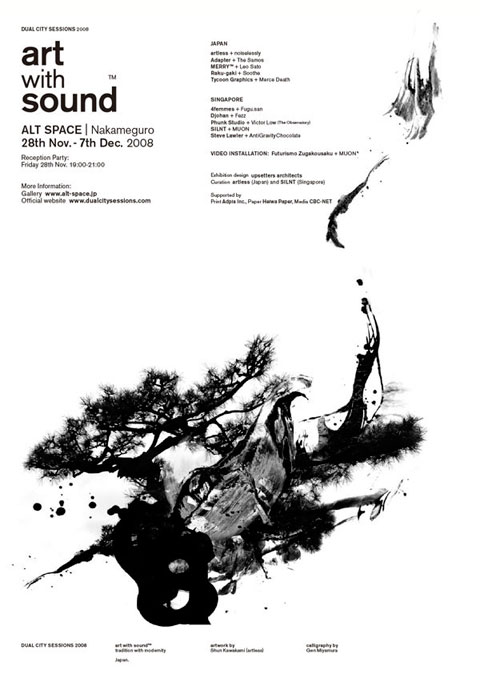
Art with Sound, is a cross-disciplinary collaboration between designers and musicians from Japan and Singapore. The exhibition brings together the complexities of the two disciplines, both innate and compelling to each other. The result will be an installation and 10 LP-sized albums, each with the designer’s artwork and musician’s piece.
Moreover, the video installation work is newly exhibited in this exhibition.
The theme(s) of this project are:
1) Tradition & Modernity
2) Influence & Change
3) Monochromatic
Art with Soundは、
日本とシンガポールのアーティスト10組が、グラフィックとサウンドをひとつにするというコラボレーション作品のエキシビション。2つの表現が影響を受け合いながら複雑に絡み合い、グラフィックそしてサウンドを変化させます。展示は、それぞれデザイナーのグラフィックとミュージシャンのサウンドのインスタレーション10作品と、10枚のLPサイズのCD作品がリリース。
また、この東京でのエキシビションでは、新たにビデオインスタレーション作品が展示されます。
プロジェクトテーマ:
1) 伝統と現代性
2) 影響と変化
3) モノクローム
–
FEATURING
JAPAN:
artless + noiselessly
Adapter + The Samos
Merry + Leo Sato
Raku-gaki + Soothe
Tycoon Graphics + Merce Death
Singapore:
4femmes + Fugu.san
Djohan + Fezz
Phunk studio + Victor Low (The Observatory)
SILNT + MUON
Steve Lawler + AntiGravityChocolate
VIDEO INSTALLATION:
Futurismo Zugakousaku + MUON
Urban Renewal: Urban Outfitters to Launch New Concept Store in L.A.
November 16th, 2008

Urban Outfitters is opening a new experimental concept store called Space15Twenty
A mix of shopping, art gallery, performance space, flea market, and cafe, it kind of sounds too good to be true. With vintage goods from New York’s What Comes Around Goes Around, books galore from Hennessey & Ingalls, and snacks from Philly-based Snack Bar
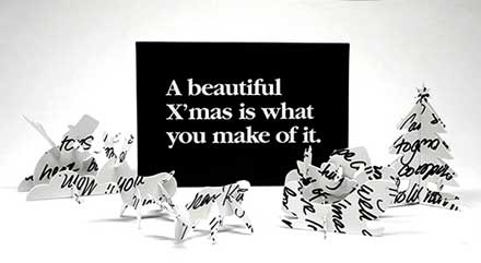
Maleonn
November 15th, 2008
这世间美丽却也残酷的一切,
总是来去如朝雾,亦如闪电,
于是我开始相信爱和自由,只存在于惊鸿一瞥间。
All things beautiful but cruel in the world
Always come and go as morning dew and lightening as well
Then I started to believe that love and freedom only exist in a glimpse
— Maleonn
K Guy
November 15th, 2008
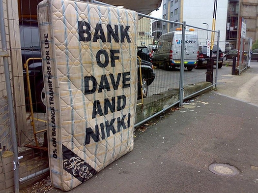
It’s been said that K-Guy is next in line for the street art crown. Approaching fast on Banksy’s heels, the UK based artist has produced a series dubbed the “Sleep Easy Family Bank”. Riffing off the idea that keeping money under your mattress is safer than keeping it in a bank, K-Guy painted and placed several of his “personal banks” around London. The series consists of real mattresses of varying sizes with owner’s names and assorted bank marketing slogans stenciled on the surface.
http://www.k-guy.co.uk/
http://graffoto1.blogspot.com/2008/11/k-guy-under-mattress-banking.html
Jean Shin
November 15th, 2008
(She used to be my professor at Pratt.)
QWOP Running!
November 15th, 2008
try this http://www.foddy.net/Athletics.html
hacking google map street view
November 14th, 2008
View Larger Map
Sampsonia Way, Pittsburgh
On May 3rd 2008, artists Robin Hewlett and Ben Kinsley invited the Google Inc. Street View team and residents of Pittsburghs Northside to collaborate on a series of tableaux along Sampsonia Way. Neighbors, and other participants from around the city, staged scenes ranging from a parade and a marathon, to a garage band practice, a seventeenth century sword fight, a heroic rescue and much more…
the making of
No Ghost Just A Shell
November 13th, 2008
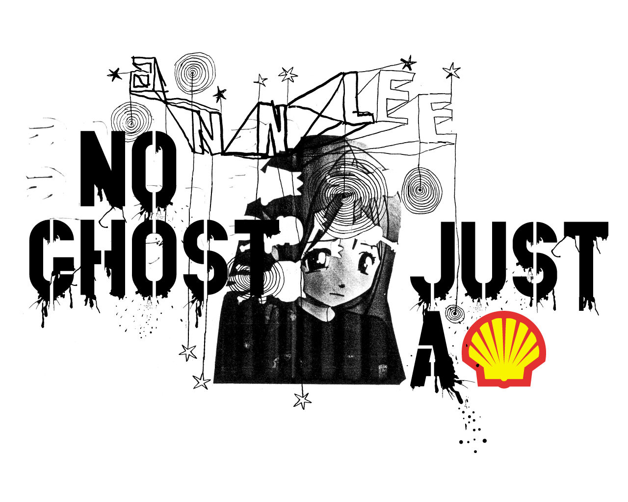
»No Ghost Just a Shell« was initiated by Philippe Parreno and Pierre Huyghe in 1999. They acquired the copyright for a figure called ‘Annlee’ and her original image from the Japanese agency »Kworks«, which develops figures (almost actors) for cartoons, comic strips, advertising and video games of the booming Japanese Manga industry. ‘Annlee’ was a cheap model: the price of a Manga figure relates to the complexity of its character traits and thus its ability to adapt to a story-line and ’survive’ several episodes. ‘Annlee’ had no particular qualities, and so she would have disappeared from the scene very quickly. “True heroes are rare and extremely expensive …” (Parreno) Buying ‘Annlee’ rescued her from an industry that had condemned her to death.
Dexter dining room chairs Amy Lau
November 12th, 2008


You’ll be sure to make a splash of a dinner party when guests sit down on one of Amy Lau’s limited edition Dexter dining room chairs. Inspired by the Showtime serial killer show, the chairs are made from white lacquered wood and upholstered in white ultraleather (i.e. vinyl). But what makes these chairs truly unusual are the hand-embroidered blood designs by Leah Picker (see detail above), splashed front and back on each chair.
Dan Is Good
November 12th, 2008
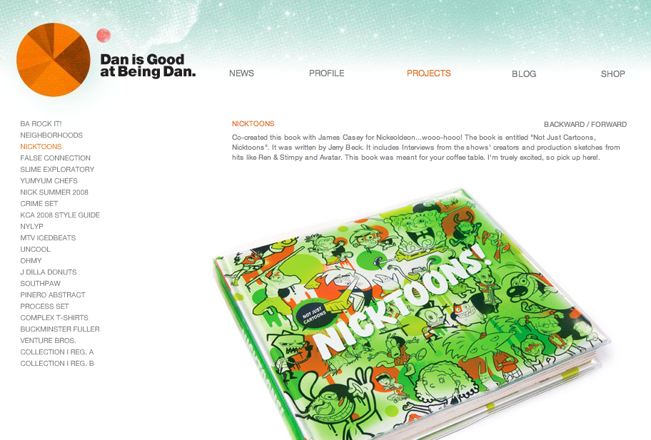
some awesome stuff and catchy url lol
Goran Krstic Relaunches
November 12th, 2008
 some amazing work by Goran
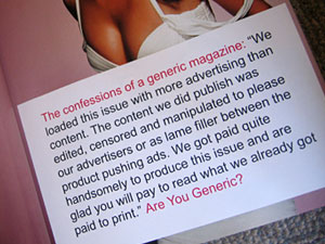
Comic Sans Cafe
November 11th, 2008
Comic Sans is the groovy script font which comes with the Windows 95 Plus! pack and is now available for the Apple Macintosh. Although it might be seen as a novelty typeface, which is great for titles, it’s also extremely readable on-screen at small sizes, making it a useful
GRAPHIC DESIGN IN THE WHITE CUBE
November 9th, 2008
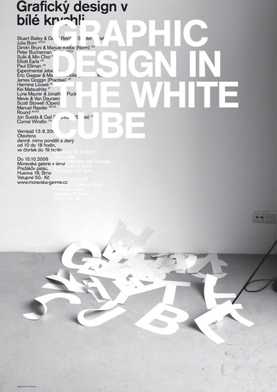
http://www.peterb.sk/graphic_design_in_the_white_cube/index.html
Organizing graphic design exhibitions is always problematic: graphic design does not exist in a vacuum, and the walls of the exhibition space effectively isolate the work of design from the real world. Placing a book, a music album, or a poster in a gallery removes it from the cultural, commercial, and historical context without which the work cannot be understood. The entire raison d’être of the work is lost as a side effect of losing the context of the work, and the result is frozen appearance stripped of meaning, liveliness and dynamism of use. In spite of this, it is more and more common to see design as ‘object’, not only in books and magazines, but also in the ‘white cube’ of the exhibition space.
Graphic design, because of its ubiquitous nature, makes a considerable impact on the visual culture that surrounds us, so it makes a lot of sense to study this influence and critically discuss the work in the context of other visual arts as well. When presented in a museum however, the exhibition should attempt more than just passive presentation in glass cases. The isolated work lacks any real information about the reasons and processes behind it. What needs to become evident is the explicit purpose of the work, to see things otherwise inaccessible, otherwise the visitor is better off going to any bookstore or strolling down a busy street to get first hand experience of and physical interaction with graphic design.
So it is in this context that we set to organize another graphic design exhibition. Being extremely self-conscious, we propose a possibility: instead of bringing work from the outside to the gallery, let’s make the work for the gallery. Instead of recreating the context for the exhibits, let’s make the gallery conditions the context for the work. Nineteen designers and collectives were commissioned to design a poster for the design exhibition in which they participate. The posters will function on two levels: the collection of posters is to constitute the exhibition, and copies of the posters will be spread around the city to inform visitors about the exhibition. This is obviously a dangerous snake-eating-its-own-tail strategy, yet the self-referential nature of the brief makes it possible to illustrate otherwise invisible mechanics of the work process.
The usual conditions of design are created in the gallery: designers were directly commissioned to make the poster in four weeks’ time, were offered a (minimal) design fee, and were asked to treat the commission just like any other projects they work on. What is perhaps unusual about the exhibition is that it makes some invisible components visible. The original brief of the project is dominantly presented in the exhibition, as are all sketches that the designers made. The objective is not to lionize the work, or create easy material for value judgment, but to uncover the process of work, presenting all the sketches that designers made, including those not leading anywhere. Failures can provide more information about visual art more than just a presentation of its successes.
Our strategy for the exhibition was to strip the design process of its deceptive aura, propose a possible format for design exhibitions, and yet present everything that a visitor to a graphic design show might expect.
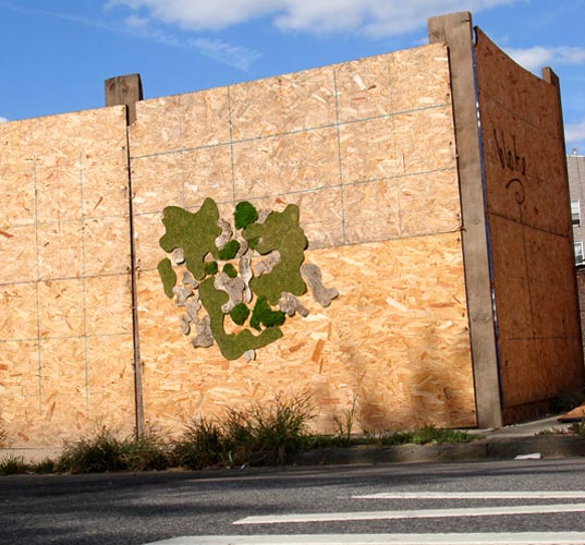
GREEN GRAFFITI by Artist Edina Tokodi
November 9th, 2008
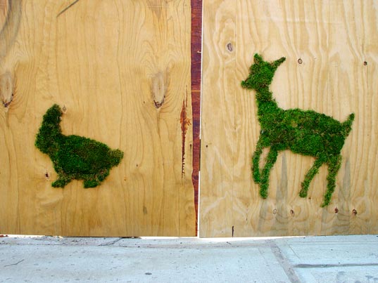
Eco-minded street artist Edina Tokodi is putting a new spin on green guerilla tactics in the trendy art enclave of Williamsburg, Brooklyn. Tokodi’s site-specific moss installations of prancing animal figures and camouflage outgrowths are the talk of a local urban neighborhood typically accustomed to gallery hype and commercial real estate take-overs. Unlike the market-driven art featured in sterile, white box galleries, the work of Tokodi is meant to be touched, felt, and in turn touch you in the playful ways that her animated installations call to mind a more familiar, environmentally friendly state in the barren patches of urban existence
Lego Fashion Show
November 8th, 2008
JCDC Versus LEGO from Four H on Vimeo.
nike :: 706
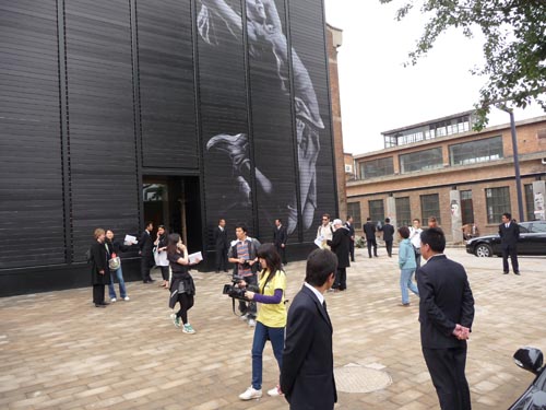
November 6th, 2008
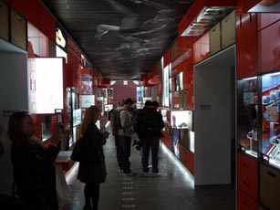
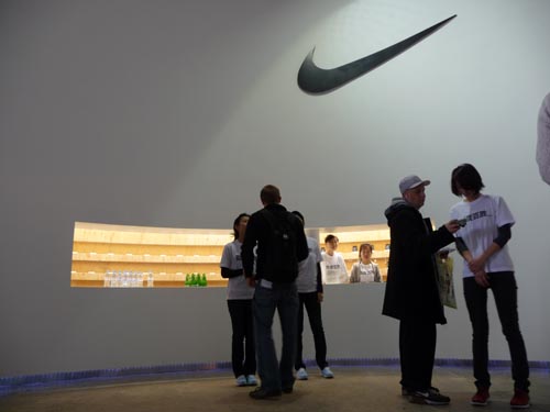
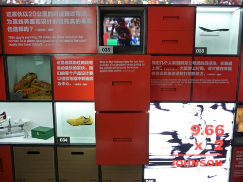
Eighty-eight days before the opening ceremony of the Olympics XXIV (on 8 August 2008) Nike filled a warehouse space in Beijing’s up and coming 798 Arts District with their 100 most innovative accomplishments and I was fortunate enough to be one of the first to see it. A gallery-like exhibit providing insight into the inspiration behind some of the game-changing footwear and apparel, it’s a clear reminder why Nike is truly one of the best at harnessing design to improve athlete performance.
The space itself is built to look like stacks of iconic orange Nike shoe boxes, some holding original prototypes and signature models. Highlights include Michael Johnson’s original gold track shoes, a prototype of Ronaldo’s Mercurial Vapor and various Tinker Hatfield prototypes that rarely see the light of day. Upon entering the space, visitors are greeted with an iPod Touch preloaded with 100 tracks highlighting a short explanation for each innovation. Interactive displays, rotating and shifting images on the ceilings and a menagerie of hard to find gems had people salivating. See more images after the jump.
http://www.nike706.com.cn/
http://www.coolhunting.com/archives/2008/05/nike_706_space.php
Diller Scofidio + Renfro / 2×4 - AIGA Lecture Nov 11
November 6th, 2008
Tuesday 11 November 2008 6:30–8:30PM
Haft Auditorium
Fashion Institute of Technology
Building C
27th Street and Seventh Avenue
PERSONAL SPACES/PUBLIC VISIONS
The architectural firm Diller Scofidio+Renfro and the graphic design studio 2×4 both create very high-concept work which is attracting not just attention, but raucous enthusiasm. For years, DS(+R) worked behind the scenes as an idea lab, and now their work is bursting onto the public scene with high-profile projects like the Institute of Contemporary Art in Boston, the upcoming High Line and Lincoln Center projects in New York, and the unforgettable “Blur” a pavilion constructed of Swiss mist.
Similarly, 2×4 was launched from an ivory tower (Yale) and is bringing a cool, fresh, and brainy approach to graphics, with thoughtfulness fueling work that transcends aesthetics. At 2×4, Michael Rock has created high-profile projects for Prada, the Brooklyn Museum, and even Nike for the Olympic Games in Beijing. Is the brainpower of both of these studios antithetical to today’s aesthetics-driven process? What comes between a laboratory of ideas and work in the public sphere? What constitutes the track from theory to practice (and back again)? And why are these visual and spatial expressions of such personal visions ultimately so magnetic for wide audiences?
irational.org
November 6th, 2008

IRATIONAL.ORG is an international system for deploying
“irational” information, services and products for the
displaced and roaming.
IRATIONAL.ORG supports independent artists and
organisations that need to maintain mission critical
information systems. These ‘Irationalists’ create work
that pushes the boundaries between the corporate realms
of business, art and engineering.
Proudly powered by WordPress. Theme developed with WordPress Theme Generator.
Copyright © _dreams. All rights reserved.
Copyright © _dreams. All rights reserved.