 A Pattern Language: Towns, Buildings, Construction by Christopher Alexander, Sara Ishikawa and Murray Silverstein of the Center for Environmental Structure of Berkeley, California and its accompanying website serve as a companion to our inquiry.Pattern Language describes a collection of 253 highly structured patterns divided into three broad categories: towns, buildings, and construction, and suggests that the same set of laws can be applied to structures at any scale. As a practical guide to help citizens understand their environment (and even build their own houses), this book encourages a democratisation of information that relieves the architect of his/her role as the exclusive idea-provider. In turn, Alexander advises architects to consider new projects in a global, everyday and political context, emphasising their obligation to shape society in a responsible manner.Task Newsletter uses Alexander’s ‘Green-Making Sequence’ pattern as a starting point. The author clearly outlines the steps needed to turn an unused neighbourhood site into a green, cooperative meeting space, starting by identifying local flora and ending with petitioning the city for future subsidies. As with all of his patterns, it should be appreciated first and foremost for what it is: a deceptively simple and literal strategy for improving one’s environment. At the same time, the knowledge that his patterns are applicable to any endeavour encourages the reader to simultaneously translate them into any personally relevant context — in our case, the structure of a publication venture: a newsletter.
Archive for the ‘dreams’ category
Forms of Inquiry: A Pattern Language
Hyo Kwon - Maybe
Maybe, The Catcher in The Rye, 2009 — in search of ambiguity, a series of phrases with
‘maybe’ was selected from the book The Catcher in the Rye by J.D. Salinger.
Chatz
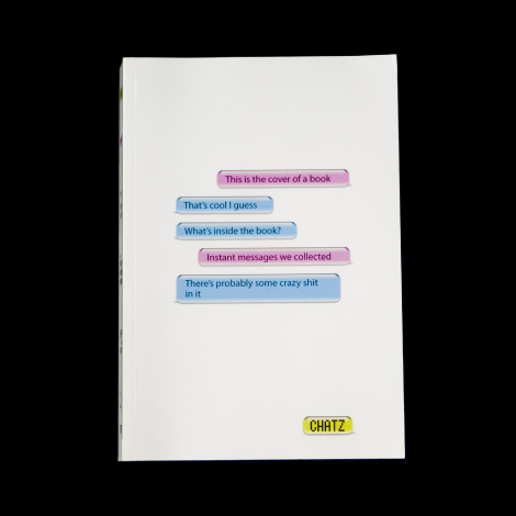
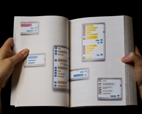
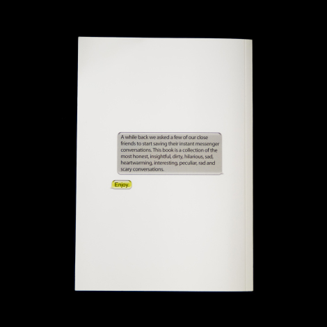 Thick book full of amusing collected iChats. Created for Dress Code.http://www.jeremiahbird.com/index.php?pid=9&comp=BOOK&pg=1
The optimism of modernity - recovering modern reasoning in typography
‘The optimism of modernity’ aims to tell the story of an incomplete and now almost forgotten project: that of modernity in British typography. This is envisaged as a matter not of style but of ‘design as a visible form of social philosophy’ and as an optimistic claim on enlightenment.
the project’s questions
The project spans a period of three or four decades, 1945–1979. Our provisional hypotheses are that:
- The products of modern typographic designing in Britain were accompanied by newly articulate forms of reasoning through practice.
- This reasoning was mainly about standardization and norms, explaining typographic processes, classification and description, and specification.
- Modernization, here as always, was double-edged.
- In order to exercise control through specification, professional designers needed information; this need, especially about typesetting systems, was made more urgent by the new challenges of computing in the graphic industries.
Toppled
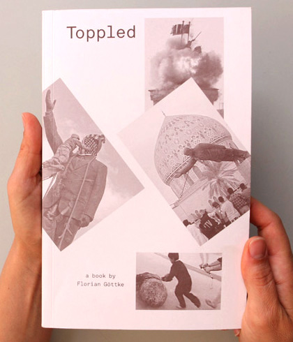
Toppled is based on hundreds of press and amateur photographs of the statues of Saddam Hussein, collected from the Internet. From this digital archive Göttke created this iconographic project, in which he analyzes and comments on the motives of the actors and the effects of the images from the viewpoints of politics, the media and image studies.
Chintelligens OFFICIAL debut single “Mika Boogie”
Anti Design Festival by Neville Brody
We are living in an age where millions of colours became 256. Difference is the enemy. Generic culture hypnotises us all into generic patterns, where control is visibly invisible. Danger is replaced by fear. New means upgrade. Risk is obsolete. Art made money stupid, and money made us fools. We welcome no_use, no_function and no_fear. Anarchy, crash and burn, the new awaits.
From Learning to Earning, and now to Yearning, we have forgotten why we are here. We have lost touch with what made us tick, the fire of creative possibility that once consumed us from within.
Revolutionary thought is but a distant memory. I grew up as part of a generation that thought it could help improve society; that our sole function was to be conscious and to spread that consciousness through creative awareness, exploration, observation and questioning.
This generation was replaced by the Thatcher/Reagan paradigm of Culture=Money. Thinkers became earners, Creatives became entertainers, and a whole dumbed-down generation now feels entitled to success and profit without having to work or think too much.
We are now left with a spiritual hollowness. The belief systems of consumption and commodity have been exposed as empty. Revolution is a distant echo lost in the white noise, and religion has been largely subsumed by globalisation. Virtual experiences have replaced human touch. Analogue culture is now the exotic.
We have managed to create for our children, perhaps for the first time in history, a future which is less hopeful than the one we live in today.
Deep Freeze
The house of credit cards has now collapsed. For 25 years we have been in a state of Deep Freeze. We have somehow denied ourselves permission to remember what it was like before the Big Bang of banking deregulation. Schools became businesses and hospitals became profit centres. Art for art’s sake was sacrificed for entertainment and bums on seats. Ideas became clichŽs and anything different was viewed with suspicion and disdain.
We have traded Freedom for Peace. What we need is Liberation.
Free Me From Freedom
As the Lehman Brothers collapsed, so a new era is signalled and the baton is passed on again. Mankind has the opportunity now to reclaim the cultural high-ground and risk something new, a creative breach in the barrier of exclusion that can allow some real growth and evolution, like a bright light shining through the cracks of a crumbling wall.
The line of Dangerous Ideas had been interrupted and the path can be found again.
Dangerous Ideas
When was the last time you encountered any culture that you can say was really dangerous, that actually challenged anything?
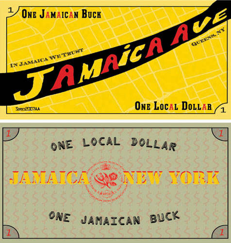
In September of 2007, we introduced Jamaican Bucks, a form of local currency for Jamaica, Queens, and posed two questions: 1. What if money made on Jamaica Avenue stayed in Jamaica; and 2. What if Jamaica had its own money?
We distributed the Bucks by creating a public photo booth where we paid participants five (5) Jamaican Bucks for their portrait, resulting in a collection of nearly 100 portraits.
The Bucks were redeemable at designated vendors for a limited time on Jamaica Avenue, a retail thoroughfare.
The goal for Counter Culture Cash was to reinforce the local economy and build connections based on trust and mutual exchange among the people in Jamaica.
This project was exhibited as part of Jamaica Flux, 2007 which was organized by Jamaica Center for Arts & Learning. It included 25 artists and ran for a period of two months.
Design is History
As a designer it is important to understand where design came from, how it developed, and who shaped its evolution. The more exposure you have to past, current and future design trends, styles and designers, the larger your problem-solving toolkit. The larger your toolkit, the more effective of a designer you can be.
Part of the graduate thesis of designer Dominic Flask, this site was created as a teaching tool for young designers just beginning to explore graphic design and as a reference tool for all designers. It is supposed to provide brief overviews of a wide range of topics rather than an in-depth study of only a few. It is a constantly evolving, changing, expanding reference library.
Meet CCA Graphic Design Alums G. Dan Covert and Andre Andreev
Writing in the Age of Email
Since World War II, composition programs in America have successively embraced three distinct (though sometimes overlapping) models of how writing should be taught, reflecting, in turn, three different assumptions about the goal of student writing. The first, a traditional model that has roots in eighteenth and nineteenth century classical rhetoric, takes the goal of writing to be imparting knowledge. Accordingly, writers are trained to focus on the “product” they are generating, with the expected attention to details of written mechanics and style. This model has persisted throughout the second half of the twentieth century, although with decreasing popularity.
The second, so-called “process” model, emphasizes the act of writing more than the written result. Students are encouraged to do considerable preplanning (”prewriting”) as well as multiple drafts, but the prescriptive mechanics of written style are de-emphasized. In both the traditional and the process models, writing is seen as an individual activity. However, while the traditional model encourages objective presentation (”It appears that . . ,” “One might argue that . . .”), the process model allows for more individual expression (”I think . . .”). In essence, the process model embraces the self-expression component of progressive education.
The third model is more social/dialogic. The purpose of writing is no longer expression of objective information or self-expression but what has come to be called the social construction of knowledge (see, e.g., Clark, 1990: Chapter 1). Rather than being a solitary activity, writing is envisioned as a group conversation, utilizing not only peer review but even group composition. Conceptually, the social/dialogic model incorporates progressive education’s views of schools as social (and socializing) institutions which, in Dewey¼s words, lead children to use their “own powers for social ends” (Lang, 1898:9).
DC Universe Online - Cinematic Trailer (Comic-Con ‘10)
Chinese Designers’ Region-In Search of Identity: Chinese Design

In Search of Identity: Chinese Design
The Chinese Designers’ Region (CDR) is delighted to invite you to a roundtable discussion hosted by CDR and associate professor Dr. Wendy Siuyi Wong. Dr. Wong will give a lecture on her current research into contemporary Chinese design. To promote the discussion on the topic, CDR also invites Moa Correia who is the author of China’s Creative Voice to talk about what she has discovered about the trends of Chinese youth culture. Selected CDR members will also present their recent works. Dr. Wong who is from York University, Toronto, is currently a research fellow at Royal College of Art (RCA). The event is sponsored by Asian Design History, MA History of Design Programme at RCA.
Date: Wednesday, 11th November, 2009
Time: 6:45 pm to 9 pm
Venue: Humanities Seminar Room, Royal College of Art, Jay Mews Building
Organized by Asian Design History, MA History of Design (Royal College of Art) and Chinese Designers’ Region (CDR)
Admission: Free
Advance booking is required. Please R.S.V.P to cdrsubscription@googlemail.com. For other inquiries and information about joining CDR, please email info@cdregion.com.
Facebook: http://www.facebook.com/event.php?eid=167633363005&index=1
www.cdregion.com
www.rca.ac.uk
——————————————————————–
Program:
1. Introduction by Chinese Designers’ Region (CDR): 5 mins
2. Presentation by Dr. Wendy Siuyi Wong: 40 mins
3. China’s Creative Voice by Moa Correia: 15 mins
4. Presentations by selected CDR members: Shi Yuan (Graphic Design), Ann Xiao (Animation), Jiang Shan(Illustration) and Weiwei He (Product design). 30 mins
5. Discussion (Chaired by William Hailiang Chen)
The relationship between a designer’s ethnic background and creative work: Rethinking the current national design identity of China
by Dr. Wendy Siuyi Wong, 40 mins
This presentation will use Communication Arts, one of the oldest and foremost graphic design trade journals in the United States, with a worldwide circulation, to trace award-winning work by designers with Chinese names over the 10-year period from 1997 to 2006. The purpose of the survey is to invoke discussion of whether or not the ethnic background of each designer is reflected in his/her work, along with questions pertaining to the relationship between design and culture. Finally, this study is designed to advance the rethinking of China’s national design in the contemporary context, in light of the country’s growing exposure to influences from the rest of the world.
Dr Wendy Siuyi Wong is Associate Professor of Design at the Faculty of Fine Arts, York University, Toronto, Canada. She was the Head of Design Department from 2005-2009, and Associate Director of the York Centre for Asian Research, 2004-2009. Her research interests are in Chinese and Hong Kong visual cultural history including graphic design, comics and advertising images. She is the author of Hong Kong Comics: A History of Manhua (2002) published by Princeton Architectural Press, 4 books for Chinese readers, and numerous articles in academic and trade journals. Dr. Wong served as a visiting scholar at Harvard University from 1999 to 2000, and was the 2000 Lubalin Curatorial Fellow at the Cooper Union School of Art, New York, USA. She also curated two major exhibits on Chinese Design held at the Cooper Union School of Art (entitled Chinese Graphic Design towards the International Sphere) in 2000, and Design Exchange (entitled Chinese Design. Everyday.) in Toronto in 2008. She has taught in the United States and Hong Kong before she moved to Canada. Currently, Dr Wong serves as a visiting research fellow at the Department of History of Design, Royal College of Art.
———————————————————-
China’s Creative Voice
By Moa Correia, 15mins
Creative Voice is a new series of publications by HuntHaggarty, which focuses on trendsetting, creative youth in fast-growing, developing economies. China’s Creative Voice, the first book in the series, reveals how Chinese youth are tired of mimicking the west and Japan, and are beginning to question their identities and are developing a unique creative language. The study provides inspiring insight, not only for global brands wanting to grow in the Chinese market, but also for those looking to learn from this remarkable group of people who are reinventing their cultural identity to shape the world’s most influential economy.
Moa Correia is brand strategy planner at HuntHaggarty and the author of China’s Creative Voice.
www.hunthaggarty.com
———————————————–
驻英华人设计师联盟(CDR)将于本月11号晚在皇家艺术学院(RCA)举办《中国设计:探寻中的定义》主题讨论会。此次讨论会由CDR与加拿大多 伦多约克大学驻皇家艺术学院的访问学者黄少仪博士(Dr. Wendy Siuyi Wong)联手策划。黄少仪博士会在讨论中带来她最新的研究课题——中国当代设计;来自伦敦独立创意公司HuntHuggarty的Moa Correia也会携其著作《中国创意之声》为大家介绍她对中国青年文化及市场的最新发现和体会。除此之外,现场还会有CDR设计师的最新作品展示及演 讲。此次活动由皇家艺术学院亚洲设计史系提供场地赞助。
Flying Lotus - MmmHmm music video (taken from Cosmogramma)
BP Photoshop disaster

This week it came to light that BP had photoshopped—poorly—an official image of their crisis command center. Apparently, that wasn’t an isolated incident. Let’s take a closer look at this view from a helicopter, shall we?
The photo, sent in by a tipster and entitled “View of the MC 252 site from the cockpit of a PHI S-92 helicopter 26 June 2010,” shows up here, a section of BP’s website that hopes to explain their response effort through pictures. This one, sadly, is fabricated.
The first thing you might notice out of place is the looming air traffic control tower in the upper left hand side of the photo:

Then, direct your attention to where the water abruptly changes shades of blue in a frenzy of pixelation, blurring, and a disappearing vessel:

Zeroing in on the pilot on the left, evidence of a pretty sloppy cutting job:

And last, while the helicopter clearly appears to be situated at some height above the boats ahead, the readouts on the dash appear to indicate that that door and ramp are open and the parking brake engaged, not to mention that the pilot appears to be holding a pre-flight checklist:

And so on. As one reader pointed out, the tower may in fact be an oil rig adjacent to a helipad (which would also explain why the pilots are in prep mode), but the photo’s still clearly been doctored. Badly.
Obviously there are bigger fish to fry when it comes to BP. But every time they fabricate an image like this, it undermines whatever little credibility they have left, along with all of the actual documentation of the massive undertaking this has been and will continue to be. It speaks to a company still more concerned with image than reality, in charge of repairing something so terribly broken that we can’t afford to treat it with anything but total candor. [BP]
http://gizmodo.com/5592836/bp-photoshops-another-official-image-again-terribly
News of Future
September 26, 2040 - Hurry up if you still have euro banknotes lying around in your drawers, Friday is the last day for you to cash them in. Officials said yesterday that they are very pleased with the transition in removing the banknotes and coins from the market.Due to the lack of demand for cash and the development of smartcards, the decision was taken five years ago to remove all euro banknotes and coins from the market. The major information campaigns and exposure in the media has given a great result, collecting more than 99,96% of the cash in circulation.
The euro was established as a unit of exchange in 1999 by 12 European Union member states and entered circulation in 2002. After only 38 years on the market you will in the future only be able to see them in a museum.
Argument: Bank of England cut the number of banknotes issued by 25 per cent between year 2001 and 2005. Due to the increase of e-commerce and the development of smartcards, the need for cash will continue to decrease, and finally be removed in year 2040.
Questions: What complications might occur if you remove banknotes and coins from a market? What necessary steps have to be taken to make it possible to take them out of circulation?
Submit your prediction.
http://www.newsoffuture.com/
Copyright © _dreams. All rights reserved.

