


my typeface professor brought in these works by this type designer today.
truly amazing and beautiful.


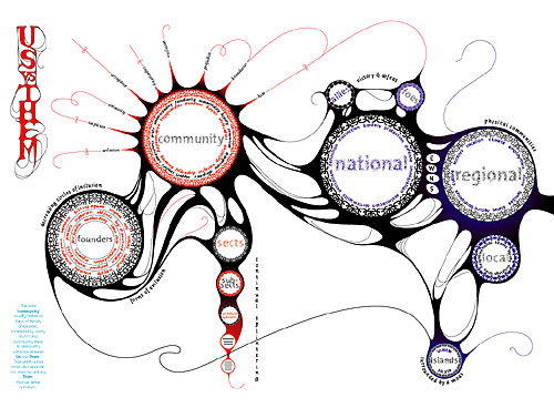
A person once said: in a backward country, Time is most prominently displayed, while in a developed country, Time seems to have disappeared. Time here refers to the rational understanding of time. People in more traditional socieities place emphasis on time, believing that the passing of time and events have a metaphysical power. Whereas in modernised socieities, time has lost its mystical power, and the sensitiveness to time has been diluted. It is not Time that has disappeared, but the cultural values and concepts that have.
john check this out; something like what you mentioned, but not really.
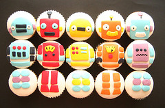
Want to give the woman who really loves (or really hates) design the best Valentine’s Day gift ever?
(Of course you do.)
Luckily, the fine design purveyors over at Citizen Citizen heard your cries for assistance.
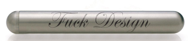
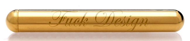
Did I mention they’re silent and waterproof? Bling.

That human life is expendable as a matter of course, that we are mortal, that life comes thus blighted as a matter of fact, as a matter of hideously brutal fact, is antithetical to any ethics putting the highest value of all on the preserving of life. An ethics that fails to take a stand against what counters it must be seen to have been subverted by it. It is illogical (and arguably unethical) for an ethical system that values life not to see mortality as fundamentally unethical. In thus arguing it would seem that you wish to make a mockery of our ethics, a critic might reply. There is death and then there is death. That life must not be extinguished, yes, that is our teaching. But when it comes to mortality itself, to try to uphold that standard would be equivalent to trying to stop a flood with a finger in the dam. No, no, one must give up on that score. And so, most ethical codes simply put to one side the issue of mortality and proceed to go on, we put it to you, quite unrealistically from there, starting off on the thither side of the crucial fact, and so, going along always to one side of the facts as they stand.
An ethics that permits no category of event, not even mortality, to be set apart for special treatment, and that considers there to be nothing more unethical than that we are required to be mortal shall be called a crisis ethics.
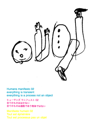
In 2003 Mike stopped working for clients and began his own graphic line “Humans” (www.humans.jp) which includes fabrics, shirts, posters and ribbons. Based in Tokyo, Humans has been exhibited at clothing stores and galleries such as Nieves in Zurich, Trip in Milan and Cow Books in Tokyo.
Universal Everythingwould like to invite you to the collaborative animation project Nokia Global Animation.
Everyone is invited to take part in a collaborative animation with 1000s of people worldwide. Heres how it works :
1. 1000s of people hold blank frames
2. Universal Everything draws cell animation onto each frame
3. We all become part of an animation which crosses the globe
4. The process continues with public submissions, creating an infinite global animation
———————————————————————————————————————-
It will be an ever-growing social piece of video art, shown on the video walls in selected Nokia Stores and related public displays.
“when in doubt, make it big. If still in doubt, make it red”

check this out too http://www.981festival.com/ and check out “Pornstar Script” on his site.
interesting typographic approach to the spam words you can see in your daily spam feed.
Can a typeface be neutral?
A typeface can certainly be more neutral than not, but absolute neutrality can be difficult to attain. ‘Both Univers and Helvetica came in for some criticism from Karl Gerstner: as being too smooth and producing too even a colour’.
The lack of colour must have been what the Modernists and Adrian Frutiger were looking for, but Gerstner claimed that because of this the typefaces were not as functional; “what has ocular clarity may appear monotonous when read.”. [Modern Typography: A critical history, Robin Kinross].
Univers was made to be the ‘universal’ typeface which gave it the functionality Modernism wanted for a typeface, but if the great designer of Univers (Adrian Fruiger) can not create the ultimate neutral typeface, can it be done? Neutral regular, medium, and bold may claim to be like their title, but unfortunately I don’t think they make the ‘neutral’ cut.
The typeface is a graduation project by Kai Bernau from the KABK, Royal Academy of Fine Arts in the Netherlands. He collected together ten typefaces and has taken their average measurements to make one (average) neutral typeface. The measurements included n-widths, H-widths, Caps height, Stroke weight and so on.
While the typeface at a glance might seem very neutral I think the flaw in the project’s neutrality is taking the average measurements from typefaces that ‘aren’t so neutral’ such as Documenta Sans, Syntax, TheSans etc. While they are great typefaces and seemingly have neutral traits, they actually have too much personality to even be considered.
So while Neutral is not neutral, it’s a pretty good typeface. It is useable (apart from having no italics), looks good (see example above), and is OpenType.
See more of the Neutral project here:
Letterlabor


