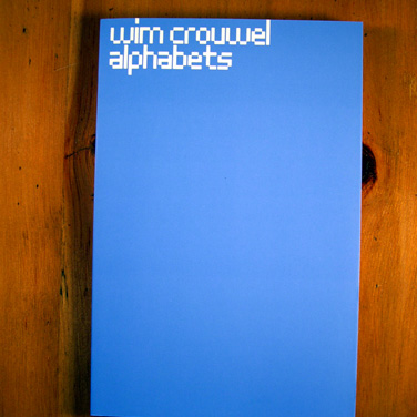
Wim Crouwel is one of the Netherlands’ greatest design icons. He is especially admired for his systematic approach and his creative handling of the shape of letters. Several of his typefaces have been released in digital form: the New Alphabet in three weights, the Fodor and Stedelijk ‘museum’ alphabets, and recently, the entire Gridnik family of letters. Today, young graphic designers pay tribute to Crouwel’s work, which dates back to the late 1950s and 1960s. Now that his typefaces are available to designers throughout the world, we are fascinated by how Crouwel himself applied them in his graphic work and long to better understand the ideas, philosophy and historical contexts of his designs.