_dreams

Dexter dining room chairs Amy Lau

November 12th, 2008

dexter_dining_roomdexter3.jpg

dexter2.jpg dexter1.jpg

You’ll be sure to make a splash of a dinner party when guests sit down on one of Amy Lau’s limited edition Dexter dining room chairs. Inspired by the Showtime serial killer show, the chairs are made from white lacquered wood and upholstered in white ultraleather (i.e. vinyl). But what makes these chairs truly unusual are the hand-embroidered blood designs by Leah Picker (see detail above), splashed front and back on each chair.

via coolhunting

by moon

Dan Is Good

November 12th, 2008

some awesome stuff and catchy url lol

by moon

Goran Krstic Relaunches

November 12th, 2008

some amazing work by Goran

by moon

Comic Sans Cafe

November 11th, 2008

Comic Sans is the groovy script font which comes with the Windows 95 Plus! pack and is now available for the Apple Macintosh. Although it might be seen as a novelty typeface, which is great for titles, it’s also extremely readable on-screen at small sizes, making it a useful text face.

http://www.microsoft.com/typography/web/fonts/comicsns/default.htm

by Nelson

Elektrosmog

November 11th, 2008

Some nice work.

by Nelson

Are You Generic?

November 11th, 2008

Cultural jamming projects:

Starbucks invasion

Magazine Confessions 

by Nelson

http://www.peterb.sk/graphic_design_in_the_white_cube/index.html

Organizing graphic design exhibitions is always problematic: graphic design does not exist in a vacuum, and the walls of the exhibition space effectively isolate the work of design from the real world. Placing a book, a music album, or a poster in a gallery removes it from the cultural, commercial, and historical context without which the work cannot be understood. The entire raison d’être of the work is lost as a side effect of losing the context of the work, and the result is frozen appearance stripped of meaning, liveliness and dynamism of use. In spite of this, it is more and more common to see design as ‘object’, not only in books and magazines, but also in the ‘white cube’ of the exhibition space.

Graphic design, because of its ubiquitous nature, makes a considerable impact on the visual culture that surrounds us, so it makes a lot of sense to study this influence and critically discuss the work in the context of other visual arts as well. When presented in a museum however, the exhibition should attempt more than just passive presentation in glass cases. The isolated work lacks any real information about the reasons and processes behind it. What needs to become evident is the explicit purpose of the work, to see things otherwise inaccessible, otherwise the visitor is better off going to any bookstore or strolling down a busy street to get first hand experience of and physical interaction with graphic design.

So it is in this context that we set to organize another graphic design exhibition. Being extremely self-conscious, we propose a possibility: instead of bringing work from the outside to the gallery, let’s make the work for the gallery. Instead of recreating the context for the exhibits, let’s make the gallery conditions the context for the work. Nineteen designers and collectives were commissioned to design a poster for the design exhibition in which they participate. The posters will function on two levels: the collection of posters is to constitute the exhibition, and copies of the posters will be spread around the city to inform visitors about the exhibition. This is obviously a dangerous snake-eating-its-own-tail strategy, yet the self-referential nature of the brief makes it possible to illustrate otherwise invisible mechanics of the work process.

The usual conditions of design are created in the gallery: designers were directly commissioned to make the poster in four weeks’ time, were offered a (minimal) design fee, and were asked to treat the commission just like any other projects they work on. What is perhaps unusual about the exhibition is that it makes some invisible components visible. The original brief of the project is dominantly presented in the exhibition, as are all sketches that the designers made. The objective is not to lionize the work, or create easy material for value judgment, but to uncover the process of work, presenting all the sketches that designers made, including those not leading anywhere. Failures can provide more information about visual art more than just a presentation of its successes.

Our strategy for the exhibition was to strip the design process of its deceptive aura, propose a possible format for design exhibitions, and yet present everything that a visitor to a graphic design show might expect.

by Nelson

Eco-minded street artist Edina Tokodi is putting a new spin on green guerilla tactics in the trendy art enclave of Williamsburg, Brooklyn. Tokodi’s site-specific moss installations of prancing animal figures and camouflage outgrowths are the talk of a local urban neighborhood typically accustomed to gallery hype and commercial real estate take-overs. Unlike the market-driven art featured in sterile, white box galleries, the work of Tokodi is meant to be touched, felt, and in turn touch you in the playful ways that her animated installations call to mind a more familiar, environmentally friendly state in the barren patches of urban existence

by Nelson

The Breeding Ground

November 9th, 2008

by Nelson

Camera Lens bracelets

November 8th, 2008

by Nelson

Lego Fashion Show

November 8th, 2008


JCDC Versus LEGO from Four H on Vimeo.

by Nelson

For those who understand…

November 8th, 2008

After all the head-shot ego trips, clutch demos, and even tough liveaction..we have this, props.

by John

Get your Mac on…

November 7th, 2008

Pictures of Apple inspired Halloween costumes taken by my friends. 2008.

by John

nike :: 706

November 6th, 2008

Eighty-eight days before the opening ceremony of the Olympics XXIV (on 8 August 2008) Nike filled a warehouse space in Beijing’s up and coming 798 Arts District with their 100 most innovative accomplishments and I was fortunate enough to be one of the first to see it. A gallery-like exhibit providing insight into the inspiration behind some of the game-changing footwear and apparel, it’s a clear reminder why Nike is truly one of the best at harnessing design to improve athlete performance.

The space itself is built to look like stacks of iconic orange Nike shoe boxes, some holding original prototypes and signature models. Highlights include Michael Johnson’s original gold track shoes, a prototype of Ronaldo’s Mercurial Vapor and various Tinker Hatfield prototypes that rarely see the light of day. Upon entering the space, visitors are greeted with an iPod Touch preloaded with 100 tracks highlighting a short explanation for each innovation. Interactive displays, rotating and shifting images on the ceilings and a menagerie of hard to find gems had people salivating. See more images after the jump.

http://www.nike706.com.cn/
http://www.coolhunting.com/archives/2008/05/nike_706_space.php


by Nelson

Tuesday 11 November 2008 6:30–8:30PM
Haft Auditorium
Fashion Institute of Technology
Building C
27th Street and Seventh Avenue


PERSONAL SPACES/PUBLIC VISIONS

The architectural firm Diller Scofidio+Renfro and the graphic design studio 2×4 both create very high-concept work which is attracting not just attention, but raucous enthusiasm. For years, DS(+R) worked behind the scenes as an idea lab, and now their work is bursting onto the public scene with high-profile projects like the Institute of Contemporary Art in Boston, the upcoming High Line and Lincoln Center projects in New York, and the unforgettable “Blur” a pavilion constructed of Swiss mist.

Similarly, 2×4 was launched from an ivory tower (Yale) and is bringing a cool, fresh, and brainy approach to graphics, with thoughtfulness fueling work that transcends aesthetics. At 2×4, Michael Rock has created high-profile projects for Prada, the Brooklyn Museum, and even Nike for the Olympic Games in Beijing. Is the brainpower of both of these studios antithetical to today’s aesthetics-driven process? What comes between a laboratory of ideas and work in the public sphere? What constitutes the track from theory to practice (and back again)? And why are these visual and spatial expressions of such personal visions ultimately so magnetic for wide audiences?

by Nelson

irational.org

November 6th, 2008

IRATIONAL.ORG is an international system for deploying
“irational” information, services and products for the
displaced and roaming.

IRATIONAL.ORG supports independent artists and
organisations that need to maintain mission critical
information systems. These ‘Irationalists’ create work
that pushes the boundaries between the corporate realms
of business, art and engineering.

by Nelson

Disney builds a Lifestyle brand

November 6th, 2008

THE most expensive piece of clothing sold by the Walt Disney Company six years ago was a $75 sweatshirt embossed with a mug shot of Mickey Mouse. By Magic Kingdom decree, home furnishings were required to exhibit at least one Disney character, leading to children’s play rugs ($65, in Pluto) and nightlights ($9.95, in Winnie the Pooh).

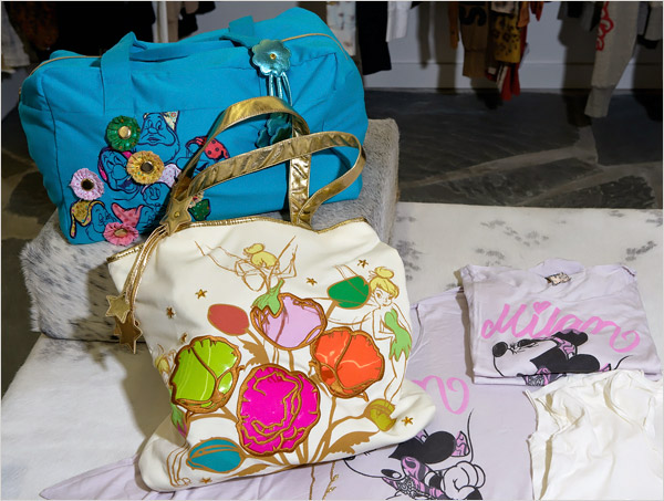
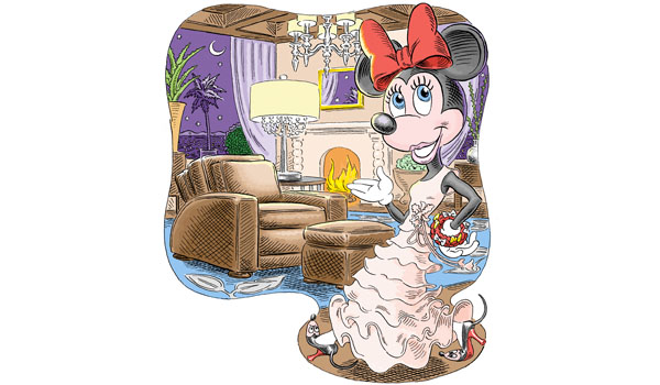
Disney still peddles all those things. But now the company also sells $3,900 designer wedding gowns — no characters in sight — and women’s cashmere sweaters “inspired by Tinker Bell.” Interior design offerings include $2,800 leather club chairs and $6,000 chandeliers patterned after the Art Deco décor in Mr. Disney’s former office. One of the company’s new products: couture soap.

Welcome to Disney, the “lifestyle brand.”

Shoppers may be surprised to learn that these pricey and Mickey-free products are from the same company that foisted “Hannah Montana” on the world and turned singing Chihuahuas into a cultural touchstone. While some of the items have recognizable characters on them, others contain only winks and nods to the company’s animated movies and theme park rides. And sometimes the only hint of Disney’s involvement is on the label.

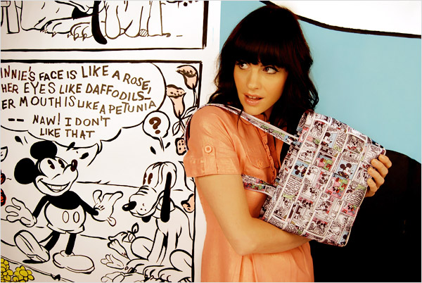
Lindsay Bern, a makeup artist for Smashbox Cosmetics, was so delighted with a lavender and silver tote bag that she received as a gift from a friend that she started using it immediately. Then, while on an airplane, a flight attendant commented on her “Alice in Wonderland” bag. “I thought she was crazy until I started looking at it more closely, and, sure enough, there was a subtle Alice hiding in the design,” Ms. Bern said.

The Disney brand, of course, is one of the most powerful in the world. It connotes quality and creativity, but also carries a strong whiff of mass culture — which can turn the noses of fashionistas skyward. It is difficult for many upscale customers and boutiques to take Disney seriously. Of her bag, Ms. Bern said, “I’ll admit it: I liked it better when I didn’t know it was from Disney.”

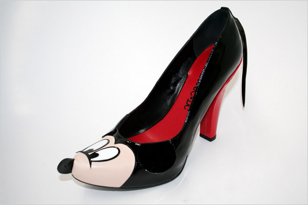
But Disney has been working hard to improve its image. Starting in 2002, the company tiptoed into high-end retail, seeking out partnerships with designers like Paul Smith, Vivienne Tam and Dolce & Gabbana, who created a $1,400 sequined Mickey Mouse T-shirt. Andy Mooney, chairman of Disney Consumer Products, thought that a smattering of designer clothes featuring Disney characters in fresh ways would gain the attention of fashion-forward shoppers. The goal was to stretch the brand a bit while adding buzz.

Now Mr. Mooney is going further, asking people to think of Disney as a brand of luxury clothing, expensive home furnishings and hip jewelry. Lest anyone be confused, the company has created labels to differentiate the new merchandise from what it sells at Disney Stores and theme parks. The “upscale, high-glam” Disney Couture is primarily for women, while guys have Bloc28, a name that refers to Mickey Mouse’s debut in 1928. The labels, featured in fashion magazines like Vogue and worn by celebrities like Rihanna, are sold only in boutiques and in department stores like Bloomingdale’s and Neiman Marcus.

full article at New York Times.
View image slideshow

by Nelson

Riitta Ikonen

November 6th, 2008

http://riittaikonen.com/ 

by Nelson

Kay Nielsen

November 6th, 2008


http://www.artsycraftsy.com/nielsen_prints.html#nielsen
http://www.bpib.com/illustrat/nielsen.htm 

via http://zelafa.blogspot.com/

by Nelson

November 4th 2008

November 5th, 2008

by Nelson

Javascript tips

November 5th, 2008

http://nettuts.com/category/tutorials/javascript-ajax/

http://ui.jquery.com/

by Nelson

Check it out here: http://nettuts.s3.amazonaws.com/082_leopard2/preview/index.html

Holy canoli. This is nuts. click on the Stacks at the bottom right and the Dashboard icon.

here’s the tutorial if you’re interested.

http://nettuts.com/tutorials/javascript-ajax/adding-to-our-leopard-desktop-with-jquery/
http://nettuts.com/tutorials/javascript-ajax/leopard-desktop-in-jquery-using-jqdock/

by Nelson

Well sung. HAHAAHA

November 5th, 2008

by John

by Nelson

After the elections…

November 5th, 2008

http://palinaspresident.us/

by Nelson

Jetblue:Happy Jetting!

November 5th, 2008

http://www.happyjetting.com/#/timeline/

by Nelson

This. Fucking. Election.

November 5th, 2008

http://thisfuckingelection.com/

by Nelson

politcally-surged messages

November 5th, 2008

via Design Observer and Eric Baker.

by Nelson

Conditional Design

November 4th, 2008

http://www.conditionaldesign.org/

Conditional Design

A manifesto for artists and designers.

Through the influence of the media and technology on our world, our lives are increasingly characterized by speed and constant change. We live in a dynamic, data-driven society that is continually sparking new forms of human interaction and social contexts. Instead of romanticizing the past, we want to adapt our way of working to coincide with these developments, and we want our work to reflect the here and now. We want to embrace the complexity of this landscape, deliver insight into it and show both its beauty and its shortcomings.

Our work focuses on processes rather than products: things that adapt to their environment, emphasize change and show difference.

Instead of operating under the terms of Graphic Design, Interaction Design, Media Art or Sound Design, we want to introduce Conditional Design as a term that refers to our approach rather than our chosen media. We conduct our activities using the methods of philosophers, engineers, inventors and mystics.

Process

The process is the product.

The most important aspects of a process are time, relationship and change.

The process produces formations rather than forms.

We search for unexpected but correlative, emergent patterns.

Even though a process has the appearance of objectivity, we realize the fact that it stems from subjective intentions.

Logic

Logic is our tool.

Logic is our method for accentuating the ungraspable.

A clear and logical setting emphasizes that which does not seem to fit within it.

We use logic to design the conditions through which the process can take place.

Design conditions using intelligible rules.

Avoid arbitrary randomness.

Difference should have a reason.

Use rules as constraints.

Constraints sharpen the perspective on the process and stimulate play within the limitations.

Input

The input is our material.

Input engages logic and activates and influences the process.

Input should come from our external and complex environment: nature, society and its human interactions.  

by Nelson

finally

November 4th, 2008

America’s first black president.

by Nelson
Proudly powered by WordPress. Theme developed with WordPress Theme Generator.
Copyright © _dreams. All rights reserved.