
Archive for the ‘branding’ category
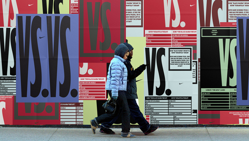
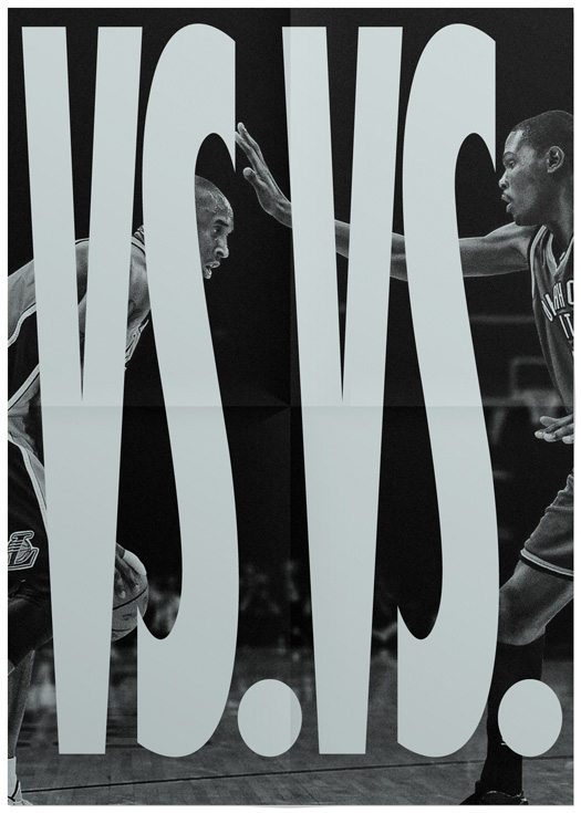
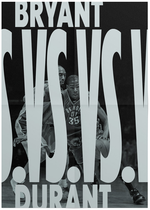
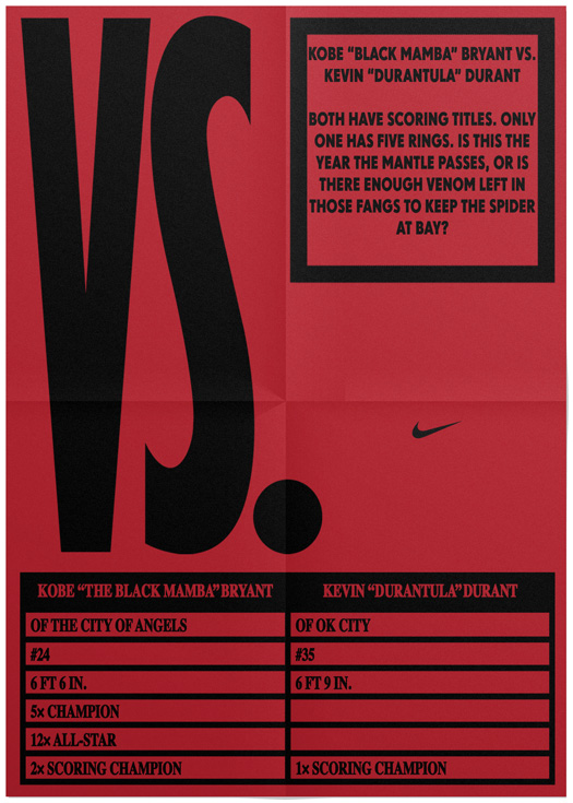
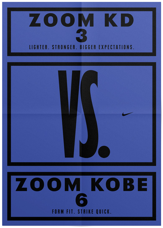
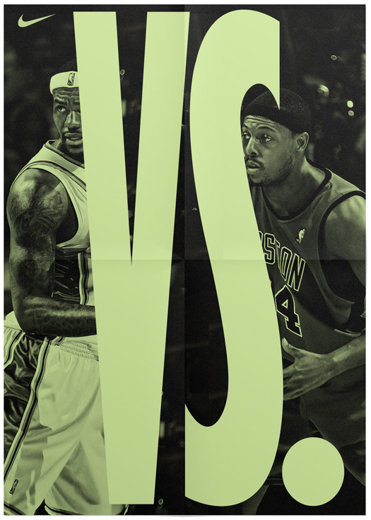
HORT: Nike VS.
Nike Basketball commissioned us to develop a visual system for their VERSUS campaign. Our job was to develop a set of rules and design graphic elements, that were adaptable and could easily be used by the nike graphic department. The theme of each poster was based on comparisons between two parties. For example two players and their statistics, or the quality characteristics of two products like shoes.
Myspace Goes Blank
![]()
Launched in 2003, Myspace — capitalized as MySpace at the time — became the de facto social networking platform for youngsters attracting 1 million users in its first year, 5 million a few months later, and over 100 million users amassed to this day. With the ability to customize their profile pages, users unleashed a fury of apocalyptic, senses-attacking, browser-crashing designs laden with unicorns and party pictures that eventually became a user interface punchline. No Myspace story is complete without the mention of Facebook which took on the reigns of the social network kingdom and became the Myspace Killer. More than killed, it wounded. And it has taken Myspace three or four years to recover, or at least attempt a recovery. And it starts this week. Myspace announced a complete redesign of its platform with new features, interactivity, and bells and whistles for its users along with a new identity.
![]()
Wrong, crooked version first shown by TechCrunch.
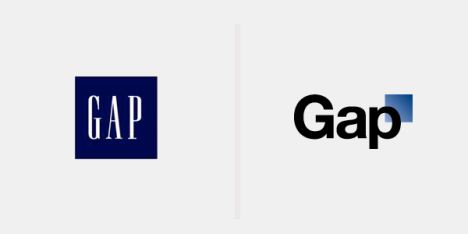
The Myspace logo was first seen earlier this month when their VP of User Experience, Mike Macadaan, showed the logo at the Warm Gun Design conference in San Francisco. The image of the logo, photographed at a weird angle and cleaned up, quickly circulated the internet to much dismay. This was right after the Gap incident so bloggers were out for blood and the Myspace logo received a premature kicking in the ass. I tried to get some actual files from Myspace at the time, but they told me they preferred to wait until the identity was rolled out. It has. And they still didn’t send me anything, but at least they have a decent page with media assets.
I contacted the media person listed to find out if this was an inside job or if the identity was given to an outside firm. Unfortunately there was no answer. (Note to corporations: Don’t list media contacts if they are going to be useless. They have one duty when an identity rolls out — or with any kind of news — and that is to answer questions from the media.)
Myspace has also introduced a new logo that captures its revamped brand identity and values. The bracket in the logo represents a space where people can express themselves, enabling users to personalize the logo and make it their own — just as they can throughout Myspace.
— Press Release
![]()
A couple of variations presented by Myspace.
The unveiling officially proves that the Myspace logo is not crooked nor its letters oddly squished. When seen in detail, however, it does prove that something weird was done to Helvetica, where the outside edges of the characters were given rounded corners. A very, very strange thing to do. Especially for a logo that is typically rendered small, it’s a detail that gets lost and only adds a weird fuzziness to the characters. The logo comes in two versions, one with the full name and the bracket, and another with just “my” and the bracket. The former probably a safe net for those that just don’t get it. The latter is where I think the concept is quite bold and actually pretty fantastic. Myspace has enough history and equity as well as the ability to present the new logo in front of its users that the leap from verbally saying Myspace to visually reading the new logo as the same is not far-fetched. It’s very commendable that Myspace went with this approach as it’s a risk. Risk of being misunderstood. Of being misread. Of being mocked. But they still did it. And that’s not an easy thing to do these days.
Logo animation. If you can’t see the animation or would like to view bigger, click here.
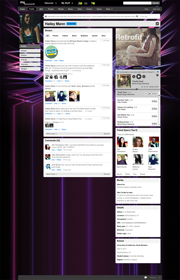
Sample Myspace profile page.
The real challenge of this identity is whether its users will take advantage of its open bracket and actually trick it out with unicorns and other apocalyptic designs. From the user profile sample above, it seems as the Myspace logo at the top will always be the official “corporate” logo. I would love to see that space being user generated and letting each profile add to the visual language of the new identity. There should be a logo generator in Myspace that allows users to easily customize it and implement into their profile, otherwise they are just relying on the users that know how to use Photoshop.
Myspace needed something drastic to signal change. This does the trick. And it does it conceptually well. The execution is not perfect but it’s not terrible either and in being a little less slick it might feel more accessible and like something you can tamper with.
via http://www.underconsideration.com/brandnew/archives/myspace_goes_blank.php
Brand New Conference
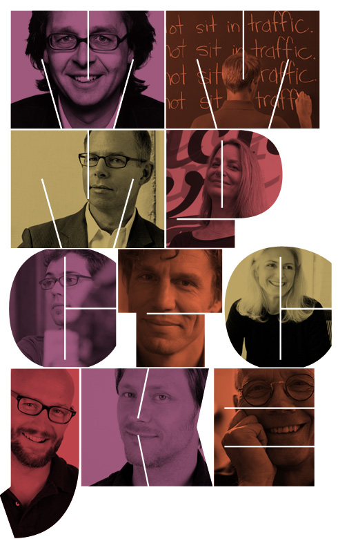
A one-day event organized by UnderConsideration on the development of corporate and brand identity projects by some of today’s most active and influential practitioners from around the world.
with
Michael Johnson
JOHNSON BANKS
London
Michael Lejeune
METRO DESIGN STUDIO
Los Angeles
Michael Bierut and Paula Scher
PENTAGRAM
New York
Christian Helms
THE DECODER RING DESIGN CONCERN
Austin
Tom Dorresteijn
STUDIO DUMBAR
Rotterdam
Connie Birdsall
LIPPINCOTT
New York
Jordan Crane and Karl Heiselman
WOLFF OLINS
New York
Erik Spiekermann
EDENSPIEKERMANN AG
Amsterdam, Berlin, Stuttgart
Metahaven: Uncorporate Identity
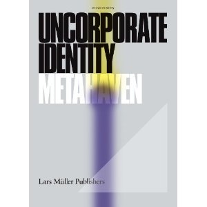
After decades of corporate identity being reduced to logos, Metahaven has undertaken a larger project to explore identity in politics and culture, online and across borders. This expansive monograph is its own project — the transformation of a design practice into a research laboratory and think tank. An important book.
http://www.amazon.com/exec/obidos/ASIN/3037781696/designobserver-20/
Adobe CS5 branding
Adobe this week unveiled their latest creation with the announcement of Creative Suite 5 and with it came revelation of the latest design and branding they are employing for the new software suite.
Shawn Cheris, Lead Designer of the Desktop Brand team, provided some background information into the process that goes into designing the branding and presentation for each product launch and provided a look through Adobe’s history of splash screens.

The branding team begins work for each Creative Suite iteration about a year and a half before the estimated launch. This process typically precludes any of the marketing work for the products, so the team has to start from a clean slate. The team designs everything associated with the presentation of the software: splash screens, application icons, graphics during the installation process, file icons—the whole nine yards. In the end, they come close to creating about 10,000 different assets for each release.
Cheris also explains how the design team had to take a 180 for the Macromedia merger in 2005: “When Adobe and Macromedia merged in 2005, the Brand Team was faced with a challenge: how to merge dozens of disparate product offerings from two companies into one cohesive system—practically overnight. Botticelli’s Venus simply wasn’t going to work anymore. We needed something simpler—something more systematic and extensible.”

“Under designer Ryan Hicks, a new system was born. Using color as a primary reference point and representing apps by a two-letter mnemonic, the Brand Team implemented a system that was both beautiful and functional. Users could easily distinguish one application from another at even the smallest sizes—a real challenge at times with the feathers and starfish icons of the early CS systems. At the time, the user community had mixed reactions, but over the years, the new system has proven to be immensely popular. We have watched with joy and amusement the appearance of countless imitators and fun surprises like hand-made CS3 pillows.”
For CS5, the branding team wanted to tread past the traditional “monolithic” design established from the Macromedia merger while still keeping the new color system intact since users had sorely missed the eccentric and dynamic designs of previous Adobe software. Inspiration for the new branding came from a diverse range of sources: “Otl Aicher’s work for the 1972 Munich Olympics, traditional drawing tools, machined metal surfaces, Swiss design, lithographic advertising posters of the early 1900s, and more.”

CS5’s presentation is based around a new grid system to ensure that they wouldn’t just be outputting rectilinear elements for the applications. The base grid was used as a foundation to create more diverse and complex shapes.


And the resulting splash screens:

The new icons continue the traditional color differentiated approach established from CS3 but now employ two main colors per application. Cheris explains how this small change has “substantially increased the visual differentiation between product icons, making it far more usable for customer who have a multitude of Adobe applications installed on their system.”

And the final product(s):

via http://www.neowin.net/news/creative-suite-5s-new-icons-and-branding
Copyright © _dreams. All rights reserved.