Launched in 2003, Myspace — capitalized as MySpace at the time — became the de facto social networking platform for youngsters attracting 1 million users in its first year, 5 million a few months later, and over 100 million users amassed to this day. With the ability to customize their profile pages, users unleashed a fury of apocalyptic, senses-attacking, browser-crashing designs laden with unicorns and party pictures that eventually became a user interface punchline. No Myspace story is complete without the mention of Facebook which took on the reigns of the social network kingdom and became the Myspace Killer. More than killed, it wounded. And it has taken Myspace three or four years to recover, or at least attempt a recovery. And it starts this week. Myspace announced a complete redesign of its platform with new features, interactivity, and bells and whistles for its users along with a new identity.

Wrong, crooked version first shown by TechCrunch.
The Myspace logo was first seen earlier this month when their VP of User Experience, Mike Macadaan, showed the logo at the Warm Gun Design conference in San Francisco. The image of the logo, photographed at a weird angle and cleaned up, quickly circulated the internet to much dismay. This was right after the Gap incident so bloggers were out for blood and the Myspace logo received a premature kicking in the ass. I tried to get some actual files from Myspace at the time, but they told me they preferred to wait until the identity was rolled out. It has. And they still didn’t send me anything, but at least they have a decent page with media assets.
I contacted the media person listed to find out if this was an inside job or if the identity was given to an outside firm. Unfortunately there was no answer. (Note to corporations: Don’t list media contacts if they are going to be useless. They have one duty when an identity rolls out — or with any kind of news — and that is to answer questions from the media.)
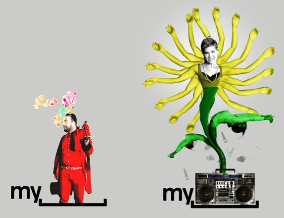
Myspace has also introduced a new logo that captures its revamped brand identity and values. The bracket in the logo represents a space where people can express themselves, enabling users to personalize the logo and make it their own — just as they can throughout Myspace.
— Press Release


A couple of variations presented by Myspace.
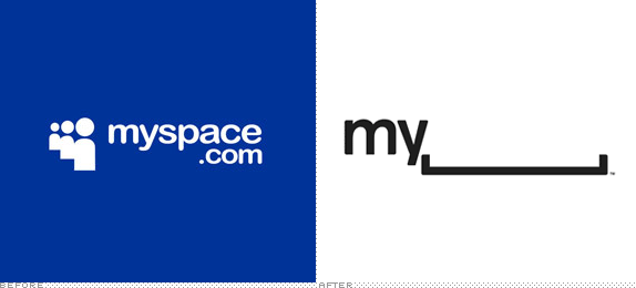
The unveiling officially proves that the Myspace logo is not crooked nor its letters oddly squished. When seen in detail, however, it does prove that something weird was done to Helvetica, where the outside edges of the characters were given rounded corners. A very, very strange thing to do. Especially for a logo that is typically rendered small, it’s a detail that gets lost and only adds a weird fuzziness to the characters. The logo comes in two versions, one with the full name and the bracket, and another with just “my” and the bracket. The former probably a safe net for those that just don’t get it. The latter is where I think the concept is quite bold and actually pretty fantastic. Myspace has enough history and equity as well as the ability to present the new logo in front of its users that the leap from verbally saying Myspace to visually reading the new logo as the same is not far-fetched. It’s very commendable that Myspace went with this approach as it’s a risk. Risk of being misunderstood. Of being misread. Of being mocked. But they still did it. And that’s not an easy thing to do these days.
Logo animation. If you can’t see the animation or would like to view bigger, click here.

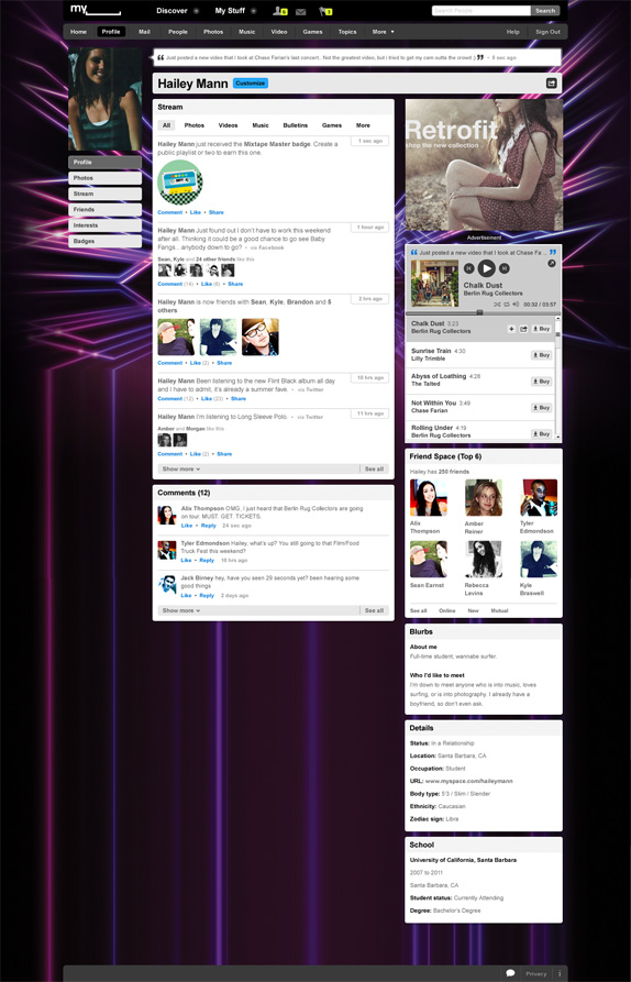
Sample Myspace profile page.
The real challenge of this identity is whether its users will take advantage of its open bracket and actually trick it out with unicorns and other apocalyptic designs. From the user profile sample above, it seems as the Myspace logo at the top will always be the official “corporate” logo. I would love to see that space being user generated and letting each profile add to the visual language of the new identity. There should be a logo generator in Myspace that allows users to easily customize it and implement into their profile, otherwise they are just relying on the users that know how to use Photoshop.
Myspace needed something drastic to signal change. This does the trick. And it does it conceptually well. The execution is not perfect but it’s not terrible either and in being a little less slick it might feel more accessible and like something you can tamper with.
via http://www.underconsideration.com/brandnew/archives/myspace_goes_blank.php
