
Archive for the ‘maps’ category

Hans Rosling’s Gapminder
January 3rd, 2010

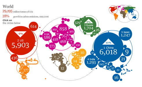
As a doctor and researcher, Hans Rosling identified a new paralytic disease induced by hunger in rural Africa. Now he looks at the bigger picture of social and economic development with his remarkable trend-revealing software.
Even the most worldly and well-traveled among us will have their perspectives shifted by Hans Rosling. A professor of global health at Sweden’s Karolinska Institute, his current work focuses on dispelling common myths about the so-called developing world, which (he points out) is no longer worlds away from the west. In fact, most of the third world is on the same trajectory toward health and prosperity, and many countries are moving twice as fast as the west did.
What sets Rosling apart isn’t just his apt observations of broad social and economic trends, but the stunning way he presents them. Guaranteed: You’ve never seen data presented like this. By any logic, a presentation that tracks global health and poverty trends should be, in a word: boring. But in Rosling’s hands, data sings. Trends come to life. And the big picture — usually hazy at best — snaps into sharp focus.
Rosling’s presentations are grounded in solid statistics (often drawn from United Nations data), illustrated by the visualization software he developed. The animations transform development statistics into moving bubbles and flowing curves that make global trends clear, intuitive and even playful. During his legendary presentations, Rosling takes this one step farther, narrating the animations with a sportscaster’s flair.
Rosling developed the breakthrough software behind his visualizations through his nonprofit Gapminder, founded with his son and daughter-in-law. The free software — which can be loaded with any data — was purchased by Google in March 2007. (Rosling met the Google founders at TED.)
Rosling began his wide-ranging career as a physician, spending many years in rural Africa tracking a rare paralytic disease (which he named konzo) and discovering its cause: hunger and badly processed cassava. He co-founded Médecins sans Frontièrs (Doctors without Borders) Sweden, wrote a textbook on global health, and as a professor at the Karolinska Institut in Stockholm initiated key international research collaborations. He’s also personally argued with many heads of state, including Fidel Castro.

Jan Chipchase: Future Perfect
July 19th, 2009
Future Perfect is about the collision of people, society and technology, drawing on issues related to the design research that I conduct in part, on behalf of my employer - Nokia.
The New York Times has a decent write-up of this research here, related media here.
I currently conduct research for Nokia Design and split my time between running user studies and developing new applications, services and products that, if I do my job right, you’ll be using 3 to 15 years from now. Prior to this role I worked as Principal Researcher in the Nokia Research Center, Tokyo. I specialize in taking teams of concept/industrial designers, psychologists, usability experts, sociologists, and ethnographers into the field and, after a fair bit of work, getting them home safely. The tough part of the job is in using the data to inform, inspire and affect how my colleagues think and what they do, and in turning research into core intellectual property that underpins the future business. Since March 2009 I live and work from Los Angeles - with stints in London, Berlin and for the last 9 years, Tokyo.
Richard Galpin
March 8th, 2009
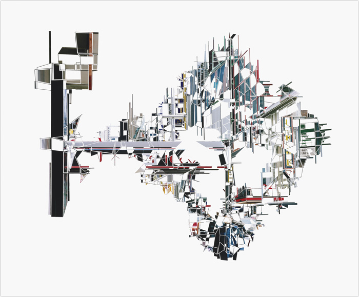
Richard Galpin’s complex art works are derived from the artist’s own photographs of chaotic cityscapes. Using only a scalpel Galpin intricately scores and peels away the emulsion from the surface of the photograph to produce a radical revision of the urban form. The artist allows himself no collaging, or additions of any kind - each delicate work is a unique piece made entirely by the erasure of photographic information.
The works enact a reimagining of the city, but their futuristic vision is predicated on the city as it is now, with the intricate details bearing traces of contemporary urban experience. Playing between abstraction and representation, the works draw their visual language from a variety of early 20th century movements such as Constructivism, and Vorticism…
http://www.richardgalpin.co.uk/
watch his process: http://www.richardgalpin.co.uk/video_large.php?image=hales_revisionary.jpg&title=Quicktime%20Video%20(119MB)

Video Game Maps
September 11th, 2008

Countless 8-bit video game maps from various Nintendo and Game Boy titles.
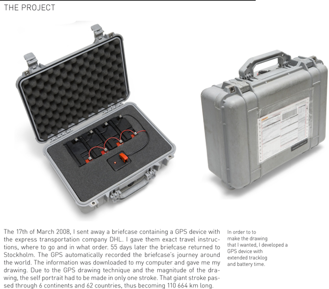
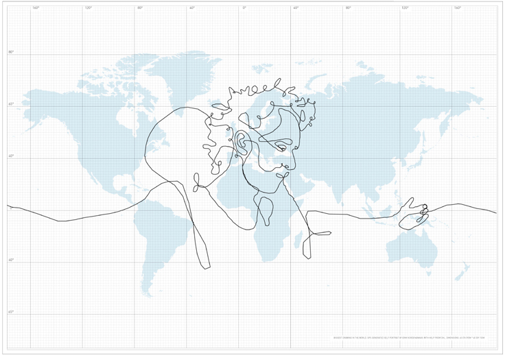
Googlemap + Timeline
June 20th, 2008
i know we’re already out of Madad’s class, but………..
Edward Hann
April 4th, 2008
Single Colour Screen Print
Internally displaced people 06, is an exploration in the theory of ‘designing for an ethical message’, using the uniformity and order of the grid, mixed with the natural topographical beauty of a landscape, to demonstrate the scale of humanitarian crisis in Western Darfur and Eastern Chad. Each print was screen printed by K2 Screen, on 240gsm GF Smith, Black Plike paper and is scaled at 720 by 1020mm.
Give up moon. Join the dark side.
April 3rd, 2008
This is for you Nelson: maps and clothes…next level?

work by Coriette Schoenarts. See more great work here.
Just say it Moon…
April 2nd, 2008


New Gravis patterns, seen at KN.
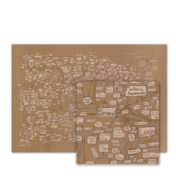
Jonathan Harris
March 22nd, 2008
Anthropologist/Storyteller/Designer/Computer Scientist/Artists
“Brooklyn-based artist Jonathan Harris’ work celebrates the world’s diversity even as it illustrates the universal concerns of its occupants. His computer programs scour the Internet for unfiltered content, which his beautiful interfaces then organize to create coherence from the chaos.
His projects are both intensely personal (the “We Feel Fine” project, made with Sep Kanvar, which scans the world’s blogs to collect snapshots of the writers’ feelings) and entirely global (the new “Universe,” which turns current events into constellations of words). But their effect is the same — to show off a world that resonates with shared emotions, concerns, problems, triumphs and troubles.”
)
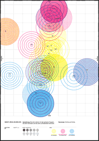
Starbucks Center of Gravity
March 19th, 2008
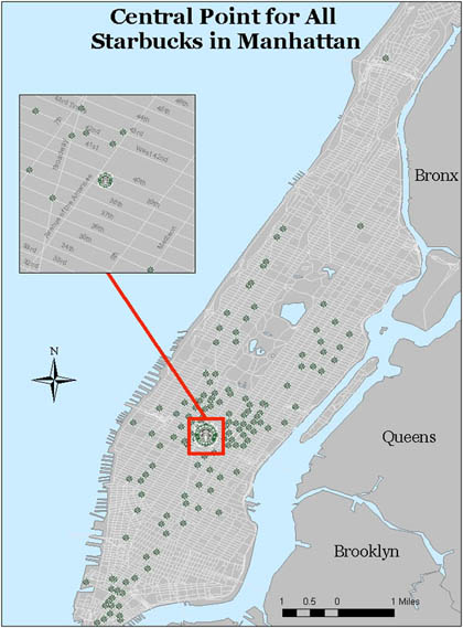
Spurred on by a discussion on Kottke.org, I decided it would be interesting to find out what the Starbucks Center of Gravity in Manhattan is (note: On kottke they are looking for density, not center of gravity which I thought was more fun…). What does “center of gravity” mean? Well, it means the exact place you can stand in Manhattan and be closest to ALL Starbucks. As if every single Starbucks was pulling you equally in its direction, this is the place where u could stand to feel the most Starbucks power…and not just within a few blocks radius, but for the whole Island! Think of it like being at the North Pole for overpriced coffee…The power center / death star if you will allow me to go that far….
Flight Density
March 19th, 2008
this is absoultely beautiful.
Flight density during one week between international airports. From SD Magazine (Japan).
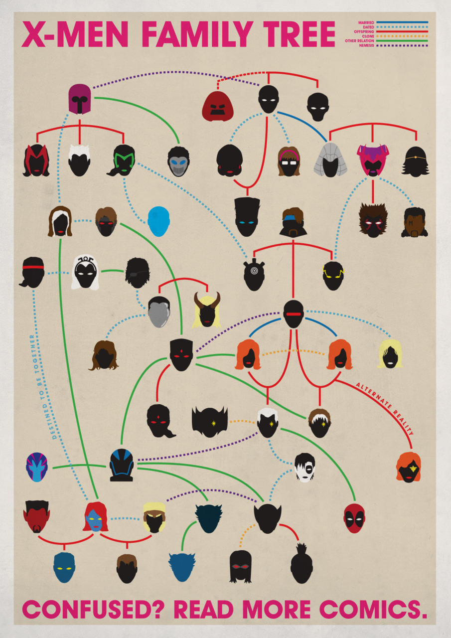
(btw i created a category called maps since there have been so many posts on them lately thanks to mr. madad.)
Proudly powered by WordPress. Theme developed with WordPress Theme Generator.
Copyright © _dreams. All rights reserved.
Copyright © _dreams. All rights reserved.