Can a typeface be neutral?
A typeface can certainly be more neutral than not, but absolute neutrality can be difficult to attain. ‘Both Univers and Helvetica came in for some criticism from Karl Gerstner: as being too smooth and producing too even a colour’.
The lack of colour must have been what the Modernists and Adrian Frutiger were looking for, but Gerstner claimed that because of this the typefaces were not as functional; “what has ocular clarity may appear monotonous when read.”. [Modern Typography: A critical history, Robin Kinross].
Univers was made to be the ‘universal’ typeface which gave it the functionality Modernism wanted for a typeface, but if the great designer of Univers (Adrian Fruiger) can not create the ultimate neutral typeface, can it be done? Neutral regular, medium, and bold may claim to be like their title, but unfortunately I don’t think they make the ‘neutral’ cut.
The typeface is a graduation project by Kai Bernau from the KABK, Royal Academy of Fine Arts in the Netherlands. He collected together ten typefaces and has taken their average measurements to make one (average) neutral typeface. The measurements included n-widths, H-widths, Caps height, Stroke weight and so on.
While the typeface at a glance might seem very neutral I think the flaw in the project’s neutrality is taking the average measurements from typefaces that ‘aren’t so neutral’ such as Documenta Sans, Syntax, TheSans etc. While they are great typefaces and seemingly have neutral traits, they actually have too much personality to even be considered.
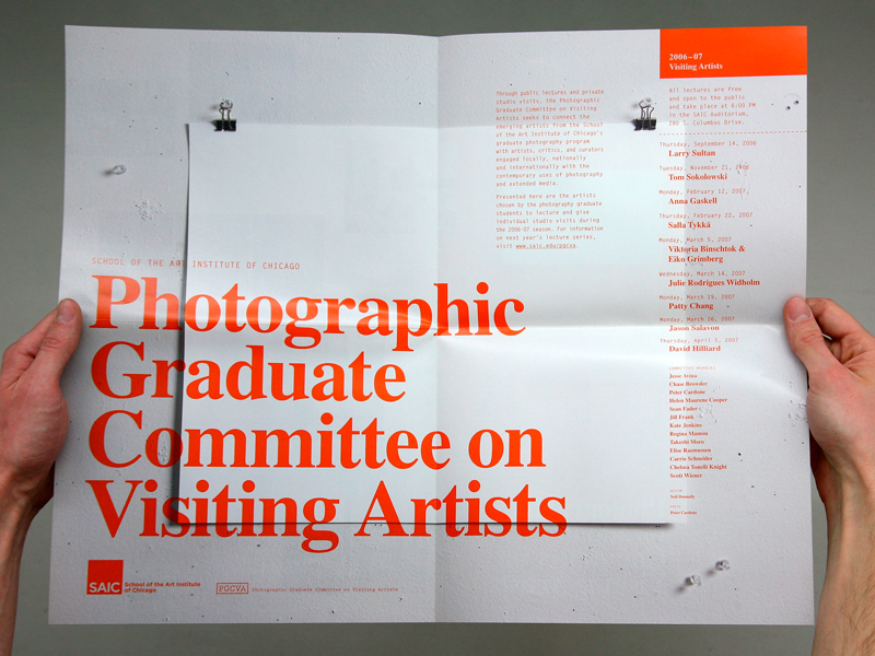
So while Neutral is not neutral, it’s a pretty good typeface. It is useable (apart from having no italics), looks good (see example above), and is OpenType.
See more of the Neutral project here:
Letterlabor

