neural.it
December 11th, 2010
 media art. hacktivism. emusic. since 1993.http://www.neural.it/
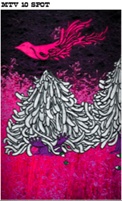
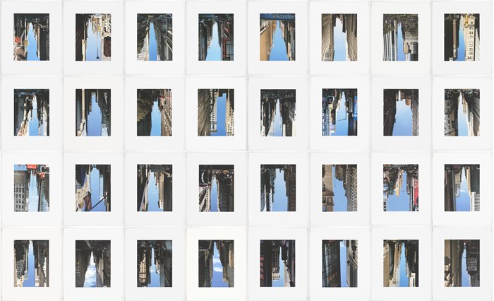
Every day the same dream
December 11th, 2010
Molleindustria
December 11th, 2010
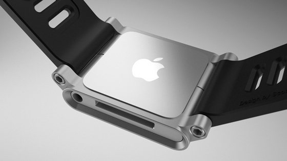
TikTok+LunaTik Multi-Touch Watch Kits
December 6th, 2010
TikTok and LunaTik simply transform the iPod Nano into the world’s coolest multi-touch watches. The idea to use the Nano as a watch was an obvious one ever since the product was announced. But we wanted to create a collection that was well designed, engineered and manufactured from premium materials and that complemented the impeccable quality of Apple products. Not just clipped on a cheap strap as an afterthought. We wanted to create a product that your friends and strangers would stop you and ask “WTF is that??? And where can I get one?!”
http://www.kickstarter.com/projects/1104350651/tiktok-lunatik-multi-touch-watch-kits

Where is Art Now? by Rick Poynor
December 3rd, 2010
Leaving the art world to decide what art is doesn’t resolve the issue of quality
Does it matter whether art exists? I don’t mean art in the ordinary sense of “visual forms of expression.” This kind of visual output clearly exists in abundance. There’s more of it coming at us, from every direction, than ever before in history. But what about “art” in the more particular sense of something that conveys deep meaning and is consequently judged to possess a special value — both cultural and monetary? Do we need that kind of art? And how do we decide what it is?
The situation has been confused for decades and it becomes more tangled with each passing year. To demonstrate the difficulty, try to come up with a brief and clear explanation of this higher kind of art that would be convincing to anyone, from any walk of life, who heard it. The task is all but impossible. Yet we proceed as though general social agreement exists about what constitutes “serious” art. We still have artists who believe themselves to be in a different category from other visual creators. There are still curators, critics, dealers and collectors. There is still art education and an art market, even if it’s doing less well than a few years ago.
The art world is largely responsible for this confusion about definitions, too. They told us that anything could be art, so long as an artist said it was. Almost anyone who goes through a gallery door is likely to have heard about Duchamp and his urinal. The art world is less good at explaining how certain people get to be artists and decide what art is for the rest of us. This process of selection might not make aesthetic or philosophical sense, but it works anyway. It’s about power: whoever holds it gets to officiate and decide. The “art world” is a way of conserving, controlling and assigning this precious resource. Once a year, Art Review publishes a list of the 100 people on the international art scene who wield the most clout. So there we have it. Even the insiders admit what’s going on.
I’m not part of the art world, but I studied art and I share some of its assumptions. I do believe the higher kind of art exists. It grips and fascinates me. There are few things I enjoy more than looking at art in museums and galleries. So all the time, like any committed gallery-goer, I’m confronted by the question: why is this object I’m gazing at art? And, conversely, why is something quite similar not art? Having reached that point, it’s impossible to avoid even trickier questions. Am I being shown things by the art world that might not be art after all? Can a piece of work be serious art even though it isn’t any good, while some other excellent piece of work fails to qualify as high art? One thing I feel confident about saying after years of looking at art is that I’m not automatically prepared to take the art world’s word for it, even if I conclude they are right about an artist or an art work. But how do I think I know? I’ll come back to that later.
Artists create “art experiences”
A few years ago, in an interview, Brian Eno came up with another way of looking at the “what is art?” question. First, he suggested that all the distinctions between high and low art boil down to commercial interests. If a work of art is going to command a high price, it has to claim a position in the center of culture that other work doesn’t have. Agreed. But Eno went much further: “The problem with the whole art object theory, the idea that art somehow resides inside objects because artists have put it there or discovered it, [is that it] creates a picture of an independent entity, a substance in the world called Art. And then the job of art historians is to decide which ones have it and which ones have more or less of it.”
Eno went on to argue that art — in the sense of some special attribute or value, objectively present in the work — doesn’t actually exist. So the question “what is art?” is a redundant enquiry; it cannot be answered. Instead, Eno switched the emphasis from the artist to the viewer. While art might not reside in the object, spectators can still feel that they are experiencing something that qualifies as art, at least for them. The artist should be redefined, Eno suggested, as “someone who creates the occasion for an art experience.” This experience could be generated by anything at all and it will be different for every viewer. Art, like beauty, also turns out to be in the eye of the beholder.
At first sight this is quite persuasive. It appears to solve the problem at a stroke. We have simply been thinking about art in the wrong way. Eno’s redefinition offers a relativistic view of art completely in keeping with all the other relativistic ideas and opinions we hold about morality, society and the meaning of life. His proposal also reflects what many people already tend to think about art, high or low. They know what they like; it’s an entirely subjective matter; the official view about what is real art and what isn’t is irrelevant to their private enjoyment and no one is going to persuade them otherwise.
The trouble with Eno’s focus on the viewer’s art experience is that it doesn’t reveal anything about the aspects of an art work that might cause the viewer to have that experience. It doesn’t recognize that we might be able to analyse those qualities, aesthetic or conceptual, and learn how they affect us from studying many art experiences. Nor does it acknowledge that artists try to create art experiences by manipulating their materials, using an understanding gained as both viewer and practitioner, in order to affect other viewers in particular ways. It further suggests that there’s no possibility of communicating with other viewers about our art experiences to see how our perceptions of a given art-experience generator (or art work) might compare.
One issue we should be able to agree on, though, is that art requires intention and action. Reality has to be manipulated or rearranged in some way. A landscape isn’t art. But a view of a landscape in the form of a painting is certainly art, according to both our linguistic and cultural uses of the term. Can it also be art in some higher sense?
The blind alley of relativism
The answer to this question isn’t culturally convenient — that’s why we struggle with it now — but we know how it goes already. High art has existed for centuries. It’s still with us, though it coexists now with many other possibilities on a continuum that extends all the way from high to low, and it’s much easier to identify in the past than in the present. High art is Dante, Shakespeare, Flaubert and Kafka. It’s Titian, Goya, Monet, Picasso, and many others. Their creations survive as part of a canon of great works that educated people have felt they should know about. This isn’t just some unscrupulous con trick practised by the ruling classes. Nothing stays in the canon over time unless enough people find it of lasting worth. This is not to say that the canon shouldn’t be continually reassessed, edited and expanded, but it remains a collective judgement on what high quality means in the history of a cultural field.
This is a difficult idea for us because we are less inclined to believe in greatness now. Several decades ago, all the dead white European males who populate our cultural history started to look oppressive to radical thinkers. This distaste has led us down the blind alley of relativism and we need to rethink. If we set aside the impossible wish to re-play history and correct all its regrettable imbalances, what distinguishes great works of art from other works judged to be of lesser cultural value is that they represent a higher order of creative intention and achievement. In form, content and technique, they show an exceptional degree of accomplishment. They handle themes common to other art of their time (and later) with a degree of intelligence, depth, fluency, expression, sensitivity and drama sufficient to impress itself even on readers and viewers with only limited experience of these art forms.
Compared to these flaming suns, other works are pale discs without heat. The unusually rich “art experiences” reported by generations of ordinary spectators and critics are a response to identifiable properties in the works themselves. The more experienced the viewer, the more alert he or she will be to these effects, and the better able to measure them against similar kinds of art.
Last year, the National Gallery in London mounted one of the most remarkable exhibitions I have seen in years. The 17th-century Spanish painted wooden sculptures in “The Sacred Made Real,” staged and illuminated with a brilliant sense of theatre, were a revelation. It wasn’t necessary to be religious to find these dark melancholy saints and martyred Christ figures profoundly emotive, or an art expert to appreciate that these were peerless masterpieces of the craft. The fierce blade of their humanity lanced out across time. And it wasn’t only me. I can rarely recall the Guardian’s art critic, Adrian Searle, who mainly covers recent art, sounding as excited and overwhelmed — “I left devastated and deeply moved” — as he did writing about “The Sacred Made Real”. It seems like bad etiquette to say it, and even a kind of modern heresy, but how often does a contemporary art exhibition poleaxe anyone like that?
Is quality a meaningful goal?
Serious art criticism, like other kinds of criticism, might have given up on the idea of evaluation. But that doesn’t lessen the viewer’s desire to experience work that seems worthwhile or “good,” and this perception of quality in relation to a work’s properties and effects must originate somewhere. While it might be felt as intensely personal, the experience is not exclusively our own. One thing the Internet has revealed more clearly than ever before is the presence of communities of taste — the discovery that other people often like the same cluster of things as us for strikingly similar reasons. Quality enriches our lives. Few things feel like a bigger waste of time than bad art.
At the same time, as 21st-century network democrats, we fervently wish to believe that everyone deserves access, that we are all creative and perhaps even artists, that elitism (being better at something and knowing it too) is totally unacceptable from other people because it affronts our ego and sense of self-worth. Miraculous tools allow us to dabble in visual pursuits we would once have left alone for lack of talent, opportunity, or both. Even the most modestly skilled image-maker can digitally bootstrap himself to a high technical standard now. The disappearance of the old career filters and disincentives, the daily deluge of new imagery, and the intoxicatingly instant self-promotion to be had from blogs and social media seems to mock the very idea of striving against the odds, on your own, perhaps for years, to produce exceptional work. Everyone floats around happily in the same online sea of mediocrity.
Somehow, if we are committed to the idea of quality, if this remains a culturally meaningful goal — does it? — then we need to strike a balance between the social aim of greater participation and a continuing faith in the critical ideal that great things are still possible for those with the drive, dedication, talent and vision to achieve them. Quality will be defined by the same criteria that informed viewers have always used as benchmarks: strength of conception, depth of content, integrity of viewpoint, originality (there’s no getting around it) and mastery of technique. It’s an enduring conceit peculiar to the conceptual art of the last 40 years that the most important thing about an art work is its “idea” and that the visual dimension really isn’t the issue. This is like poets holding the view that crafting well-turned lines is of marginal interest for literature, or jazz musicians claiming that being able to play their instruments is a red herring and then informing audiences that they are simple-minded to see it any other way.
So we need to put more emphasis again on the visual in art, and it’s clear that many young artists with visual talent have decided to ignore the art world’s weary, self-serving conceptualist strictures and just go ahead and make the art they feel like making. They want to create optical art experiences of their own. By paying too much attention to the extremes of high or low we run the risk of undervaluing what’s happening in the densely populated middle — graphic novels, graphic design, illustration, low-cost film-making — where the expressive possibilities of the visual are still embraced with conviction. This, rather than art scene-mediated art, is the real center of visual culture in our time. Are we overlooking great work only because we have been instructed for so long to assume that anything presented outside the art world’s walls must be inferior?
Non-official art of this kind is a contemporary salon des refusés for anyone who resists the by-invitation-only policy of the now thoroughly professionalized and institutionalized artist/dealer/curator nexus. It remains to be seen whether this zone of wild, unregulated and largely unmonitored creativity is where the masterpieces of the future will come from, but with the gates wide open, there is every reason to hope.
This essay first appeared in Elephant magazine no. 4, and is republished here with permission.
via http://observatory.designobserver.com/entry.html?entry=22938
You Must Know Why Your Work is Important.
December 1st, 2010
When you first arrive, read and think widely and exhaustively for a year. Assume that everything you read is bullshit until the author manages to convince you that it isn’t. If you do not understand something, don’t feel bad - it’s not your fault, it’s the author’s. He didn’t write clearly enough.
If some authority figure tells you that you aren’t accomplishing anything because you aren’t taking courses and you aren’t gathering data, tell him what you’re up to. If he persists, tell him to bug off, because you know what you’re doing, dammit.
This is a hard stage to get through because you will feel guilty about not getting going on your own research. You will continually be asking yourself, “What am I doing here?” Be patient. This stage is critical to your personal development and to maintaining the flow of new ideas into science. Here you decide what constitutes an important problem. You must arrive at this decision independently for two reasons. First, if someone hands you a problem, you won’t feel that it is yours, you won’t have that possessiveness that makes you want to work on it, defend it, fight for it, and make it come out beautifully. Secondly, your PhD work will shape your future. It is your choice of a field in which to carry out a life’s work. It is also important to the dynamic of science that your entry be well thought out. This is one point where you can start a whole new area of research. Remember, what sense does it make to start gathering data if you don’t know - and I mean really know - why you’re doing it?
Poster Machine
December 1st, 2010

(Homage to Yves Klein’s Anthropometry series)
3 posters, 40×62″
For a workshop to create any kind of poster-generating machine, I decided to use living creatures to make a poster, inspired by Yve Klein’s Anthropometry series.
While Klein employed and directed human models
to make imprints of their bodies on a large canvas,
I let hundreds of fruit flies make imprints of their tiny bodies on a tiny piece of paper. Since I couldn’t really direct the flies, I anesthetized them with carbon dioxide and placed them on a puddle of watercolor paint. As they woke up and tried to escape from the watercolor ocean and dry their wings and legs, they made traces and imprints.
As I resized the tiny original posters into huge posters, the imprints became something unfamiliar and unexpected.

Diaspar
November 29th, 2010
DIASPAR is forty-five reactions to randomness generated by internationally recognised experts from dozens of different fields. These articles overlap each other in complex ways, drawing lines of connection that crosshatch into a map which must be navigated as a labyrinth. It slowly explains itself as you travel through it, but there is no end (or beginning).


DropMocks
November 26th, 2010

Do you ever want to share some photos, mockups or screengrabs with somebody else online quick and dirty? Go to DropMocks, drag and drop your images, and you are done. You get an instant image gallery that displays in CoverFlow style, along with a short URL to share it.
For instance, here is an example of a DropMocks I put together in 5 seconds by pulling some photos from my desktop. Same here with these screengrabs. You can name your gallery and save it, and that is pretty much it.
DropMocks is a side project of Glen Murphy, a UI designer for Google Chrome (both the browser and the OS). It is all done with HTML5 technologies. No Flash, just CSS and Javascript. It uploads and displays very fast. Please note, this is not for private sharing. Once you upload, anyone with the link can see your gallery.
 s
sNew York TDC in China
November 26th, 2010
中国巡回展杭州站")
中国巡回展杭州站")
中国巡回展杭州站")
中国巡回展杭州站")
中国巡回展杭州站")
中国巡回展杭州站")
中国巡回展杭州站")
中国巡回展杭州站")
中国巡回展杭州站")
中国巡回展杭州站")
中国巡回展杭州站")
中国巡回展杭州站")
中国巡回展杭州站")
中国巡回展杭州站")
中国巡回展杭州站")
中国巡回展杭州站")
中国巡回展杭州站")
中国巡回展杭州站")
中国巡回展杭州站")
中国巡回展杭州站")
中国巡回展杭州站")
中国巡回展杭州站")
中国巡回展杭州站")
中国巡回展杭州站")
中国巡回展杭州站")
中国巡回展杭州站")
中国巡回展杭州站")
中国巡回展杭州站")
中国巡回展杭州站")
中国巡回展杭州站")
中国巡回展杭州站")
中国巡回展杭州站")
中国巡回展杭州站")
中国巡回展杭州站")
中国巡回展杭州站")
中国巡回展杭州站")
中国巡回展杭州站")
中国巡回展杭州站")
中国巡回展杭州站")
中国巡回展杭州站")
中国巡回展杭州站")
中国巡回展杭州站")
中国巡回展杭州站")
中国巡回展杭州站")
中国巡回展杭州站")
中国巡回展杭州站")
中国巡回展杭州站")
中国巡回展杭州站")
中国巡回展杭州站")
中国巡回展杭州站")
中国巡回展杭州站")
中国巡回展杭州站")
中国巡回展杭州站")
中国巡回展杭州站")
中国巡回展杭州站")
中国巡回展杭州站")
中国巡回展杭州站")
中国巡回展杭州站")
中国巡回展杭州站")
中国巡回展杭州站")
中国巡回展杭州站")
中国巡回展杭州站")
中国巡回展杭州站")
中国巡回展杭州站")
中国巡回展杭州站")
中国巡回展杭州站")
中国巡回展杭州站")
Tokyo graphic passport 2010
November 26th, 2010
")
")
")
")
")
")
")
")
")
")
")
")
")
")
")
")
")
")
")
")
")
")
")
")
")
")
")
")
")
")
Dont Hate
November 25th, 2010
Don’t Hate, LLC is a NYC-based creative collective that designs experience-driven entertainment products. We are led by Jamie Carreiro and Keiji Ando.
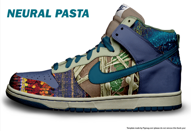
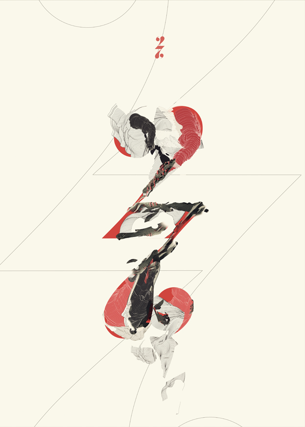
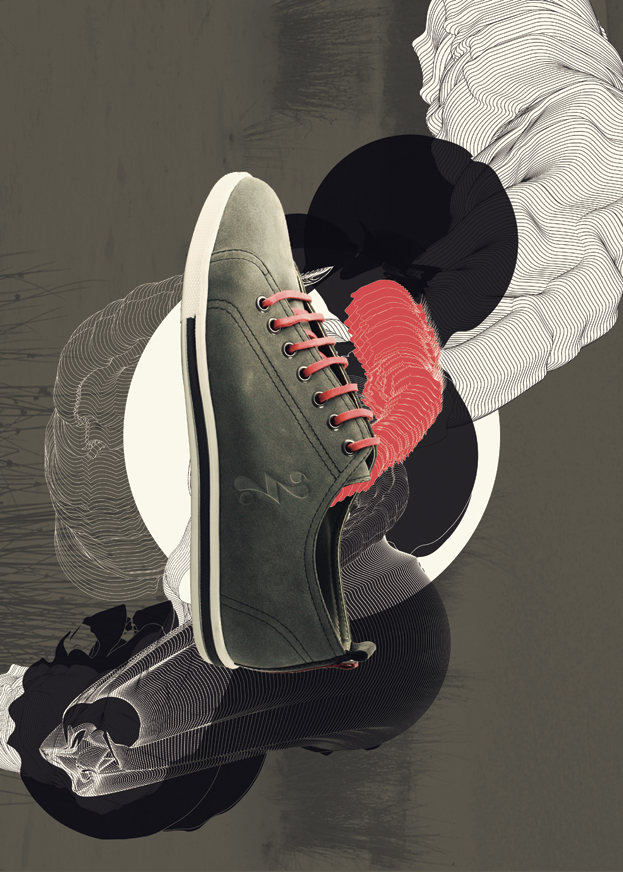
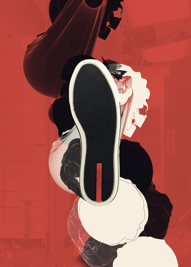
It’s all about the shoe
November 25th, 2010
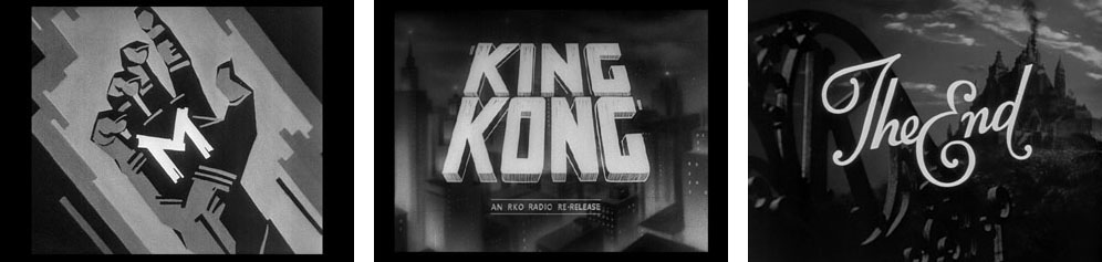
‘The End’ of Warner Bros.
November 24th, 2010
This is the first page in a series dedicated to the ‘The End’ title screen. To show the evolution in their designs I decided to dedicate one single page to a studio.
More pages will follow (at the end of next month/year).
Unlike other studios Warner Bros. managed to maintain consistency in their designs. Their logo, which hasn’t changed much since the early 1930s, is present in every design they’ve done.
The images displayed here are from movies made from 1924 (Beau Brummel) to 1967 (Cool hand Luke and Wait until dark). Earlier films – Warner Bros. made their first film in 1918 – are either lost or not yet available on dvd.
more at http://www.annyas.com/screenshots/the-end-titles-warner-bros/


Movie Title stills collection
November 24th, 2010
“I’ve seen a lot of movies over the years, and to prove I’ve sat through at least the first ten minutes of them I started making screenshots of the titles. Then my computer crashed and I almost lost them all. To save them for future generations I created this little website.”
Expansion & Collapse
November 24th, 2010
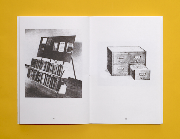
Expansion & Collapse is an ongoing collaborative project between Fay Nicolson and Oliver Smith exploring processes of acquiring, organising and displaying visual research. Within this project we trace relationships between traditional sites for storing information (libraries, archives and shelving systems) and new digital, networked and compressed sites for accessing ‘knowledge’- making connections between schematic and architectural, real and hypothetical spaces.
K+W shirt
November 20th, 2010
You are viewing a genuine shirt with our W+K logo changed to K+W on it, per David Kennedy’s instructions. While it’s almost certainly too late for such emendations to have any effect, that’s not really what the shirt is about. designed by: David Kennedy 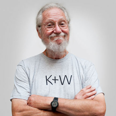
Emily Pilloton: Teaching design for change
November 20th, 2010
Graphics, Images, Chinese
November 20th, 2010
http://earstone.com/indexhibit/index.php?/projects/graphics-images-chinese/
After ten days of travelling China, I designed an image book of personal impression on Chinese graphic design. The Chinese designers I met had a great love for their traditions, but at the same time seemed to be under the pressure to break out of the traditions. Long explanations were excluded in my work. Rather, I tried to communicate only with images and a few words. This book is on sale at an independent publisher book store in Seoul.
2009, 150×220mm, 56pages, Offset print. Book
2009, 590×850mm, Digital print. Poster


Proudly powered by WordPress. Theme developed with WordPress Theme Generator.
Copyright © _dreams. All rights reserved.
Copyright © _dreams. All rights reserved.