
Duplex Planet
January 15th, 2011
The Duplex Planet is an ongoing work designed to portray a wide variety of real characters who are old or in decline. In our culture, exposure to people at this point in their lives is generallylimited to seeing family members age and, since that points directly to one’s own mortality, it’s hard to glean much in the way of an objective example.
In 1979 I took a job as activities director at a nursing home in Boston. I had just completed a degree in fine arts as a painter. On the day that I first met the residents of the nursing home, I abandoned painting. That is to say, I discarded the brushes and canvas, not the underlying desire to see something in the world around me and then communicate it to others. In this unexpected setting I found my medium. I wanted others to know these people as I did.
From the start I felt that oral history was unsuitable to my needs. When newcomers hear that I have regular conversations and interviews with elderly people, they assume I collect oral history. What that assumption implies is that when one grows old we become solely a repository of our past. This notion is so entrenched that we seem to willingly grow old, talking only of our past. From the start, my mission has been to offer a range of characters who are already old, so that we can get to know them as they are in the present, without celebrating or mourning who they were before. Since the elderly are already thought of by what they have in common - that they’re all old - I try to recast them as individuals. I quote and write about them in order to address the larger world. The audience/reader meets them and comes to feel the characters are familiar, people they might want to spend time with. The men and women whose individualities expose the myths of aging are not extraordinary. They are typical in their unique humanness.
A Conversation with Daniel van der Velden of Metahaven
January 14th, 2011
WD: Your work reveals both respect for and deep suspicion of the power of borders. Did that interest derive from your graphic design proclivities, or is design the medium through which you express long-held, deeply rooted philosophical insights?
DvdV: A border on a map is, literally, a graphic device. It is the line dividing two territories. I guess we have always been into borders because they do politically what graphic shapes do visually. Design is absolutely the medium to grapple with this kind of issue. Despite the fact that we live in a connected world of mobility — or maybe even because of it — the power of borders is increasing. Border protection is on the rise, not just geographically but also electronically. Our book Uncorporate Identity contains the example of European countries boasting colorful, Miro-styled tourist identities, while in African countries, these same countries broadcast shrill, dystopian video clips saying: “Don’t try to come here.” An open door for one person is a closed gate for another.
via http://observatory.designobserver.com/entry.html?entry=23688
Winterhouse Studio
January 14th, 2011
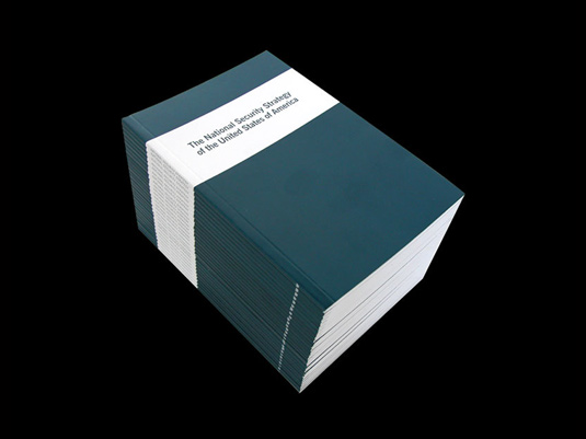
DvdV: From that afternoon in Brno I remember your own presentation, along with Jonathan Barnbrook’s and Linda van Deursen’s. After my presentation you immediately advised me to show less work — I think, an early warning of our differences: your preference for clarity and simplicity, and mine for avalanche, at the time maybe even much more so than now. Your talk showed how you have always been compelled to do design yet are driven and inspired by non-design topics that ranged from poetry to politics. I feel related to that idea and familiar with its problems. I’d say, however, that is what design is essentially about. Design is about the world, other people, other things, via you the designer, the gatekeeper. You are the filter. In my view, one of the most intriguing books you designed is the National Security Strategy of the United States, created after September 11. This was a book you sent to me straight after we had first met in Brno. I think of it as a document with historical value.
WD: When I published the National Security Strategy of the United States in 2002, it was the act of a frustrated citizen who had the tools of graphic design and publishing in his hands. The New York Times had only published excerpts of this new U.S. policy, but it was immediately clear that this document, freely available on the White House website, foretold the future — America would engage in a war on terrorism on its own terms, without regard to international law or the Geneva Conventions. (The torture at Abu Ghraib was clearly foreshadowed here.) To publish it only 48 hours after the new policy was released (of course, after fixing a few typos in the original document) was the real accomplishment: making it a book moved it beyond recent news into another, more permanent zone. Ironically, it is the least interesting design we have ever created, but perhaps the most influential book we have ever published — it sold 20,000 copies the next year, all through private distribution. Looking back, I believe this was the first time I used my role as a graphic designer and publisher to further purely personal political goals, and with no client agenda or backing. This was not design research or a designer-as-author endeavor — this was simply an act of political outrage. The design was in the act, not the execution. I’d like to believe that publishing this blight on American values had an impact, but it was solid journalism (by writers such as Mark Danner, to name just one) that would ultimately tell the real story of this misguided U.S. policy.


Lars Muller lecture at AA Schol of Architecture
January 5th, 2011
http://www.aaschool.ac.uk//VIDEO/lecture.php?ID=1201
Lars Müller
Communicating Architecture
Date: 02.03.2010
Time: 18:00:00
Running time: 90 mins
Editorial conditions and design rules have changed now that the book shares its formerly unique media position with new and challenging offers by digital media. The lecture will introduce the potentials of the book as a medium for the communication of architecture and will analyse the structural and functional differences between analogue and digital media and their abilities and limits in the expression and communication of architectural atmosphere.
Lars Müller is founder of Lars Müller Publishers (lars-mueller-publishers.com), best known for its editions of design, art, photography and architecture that have set standards in architecture publishing. Recently, the company has expanded its catalogue, bringing the same rigour and attention to social and political books as it brings to books in the creative field. Müller, an active educator since 1985, is teaching a course on Communicating Architecture at Harvard’s GSD.
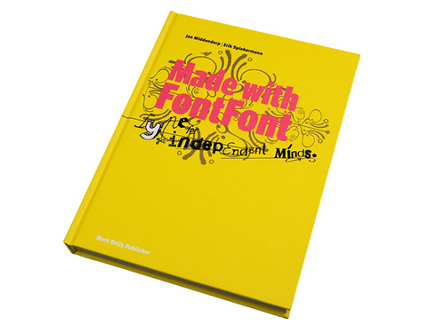
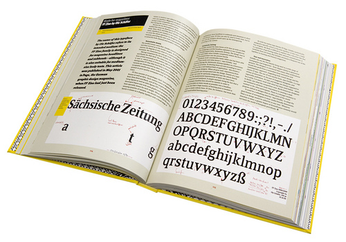
Spiekermann on Founding FontShop
January 3rd, 2011
Starting up FontShop was only the beginning of Erik Spiekermann’s ventures in digital type. Soon after the launch of the original vendor of digital type he teamed up with that other famous graphic designer, Neville Brody, and founded FontFont, which has since then become the largest independent foundry of original type designs. Not only does it produce some contemporary classics, but it also houses wildly imaginative designs, and spearheaded many innovations in digital type technology.
he idea came because we suddenly saw all this great stuff being done by young type designers, mainly in the Netherlands. Two of them, Just van Rossum and Erik van Blokland, worked with me at MetaDesign in Berlin. They had Beowolf – the first RandomFont – that took PostScript into previously uncharted territory. And then there were friends like Max Kisman and Martin Majoor. The little publication Five Dutch Type Designers showcasing the first FontFont release included some of these new typefaces from the Netherlands. Neville Brody also had some artwork lying around that could be turned into digital fonts fairly quickly, and I had that old typeface that the German Post Office (Deutsche Bundespost) did not want: PT 55, to be re-issued as FF Meta.
FONTSHOP: http://www.fontshop.com
FONTFONT: http://www.fontfont.com/
Spiekermann blog: http://spiekermann.com/
wordmark.it
December 30th, 2010
I don’t know if it’s just me but I find myself skimming through my font library every time I am about to design a new wordmark. And the fonts that I end up using are mostly the ones that are already activated/installed on the system.
Socialism and Print
December 20th, 2010
“The greatest modernizers inaugurate their career with a backward leap, and a renaissance proceeds through a return to the past, a recycling, and hence a revolution. (…) Behind the ‘re’ of reformation, republic or revolution, there is a hand flicking through the pages of a book, from the end back to the beginning. Whereas the finger that pushes a button, fast-forwarding a tape or disc, will never pose a danger to the establishment”.
-Régis Debray. ‘Socialism and Print’ (2007)
Michiel Schuurman
December 19th, 2010
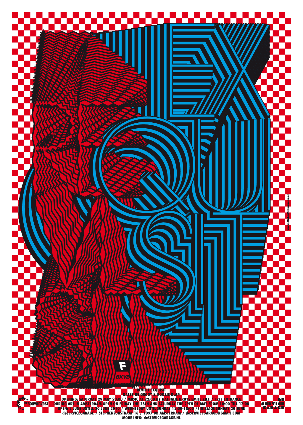
Michiel (Amsterdam 1974) studied graphic design and typography for two years on the Koninklijke Academie voor de Beeldende Kunsten Den Haag and graduated as graphic designer in 2002 on the Gerrit Rietveld Academy Amsterdam.
His work is almost always about altering typography to the point where it fully replaces image. The sometimes psychedelic designs are strongly based on classic typographic laws and high contrasts of patterns and colors.
SOUR ‘映し鏡’(Mirror)
December 17th, 2010
This is an interactive music video for SOUR ‘Mirror’. (non - connected version in Japanese) Please visit http://sour-mirror.jp and experience the full connected version!
China Zine by Craig Atkinson
December 16th, 2010
| http://www.caferoyalbooks.com/160
|
|
||||||
 |
|||||||
 |
|||||||
 |

Stefan’s advice
December 13th, 2010
geocitiesizer
December 13th, 2010
http://wonder-tonic.com/geocitiesizer/content.php?theme=2&music=7&url=dreams.neonspice.net
Do any site here: http://wonder-tonic.com/geocitiesizer/
Proudly powered by WordPress. Theme developed with WordPress Theme Generator.
Copyright © _dreams. All rights reserved.
Copyright © _dreams. All rights reserved.