The ‘2THESKY’ in the title alludes to Araki’s conviction that photographs are a secondary thing, not creation but an imitation or counterfeit of reality, and expresses his desire to create ‘another sky that is mine’ by writing in the sky.
“After the death of my wife, Yoko, all I did was take photographs of the sky from my balcony, because if it’s not the sky from your own balcony it’s not the real sky, is it. This time I composed everything in the sky, as if the sky was the film. I copied things and wrote calligraphy over the top of these photographs so that the results were a kind of diary etched into film in the form of the sky. Until now I’ve referred to the sky as a mirror or a window reflecting my own soul, but this time I used the sky as a canvas and I realized that the sky itself is now the film.”

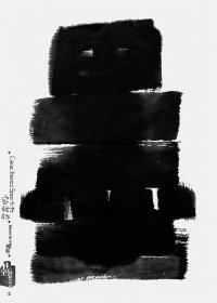
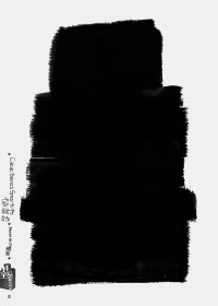
2THESKY, my Ender 2009
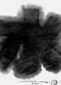
Left: Acrylic on b&w photograph, 50.8 x 60cm 27 January (the anniversary of his wife’s death)
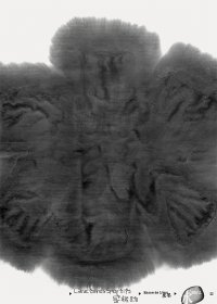
Right: Mixed media on b&w photograph, 50.8 x 60cm 7 July (his wedding anniversary)
The works include black and white photographs of the sky over which Araki has collaged photographs or polaroids of those who have passed away or written excerpts from death notices or news articles or, on the anniversary of Yoko’s death, things written when she died, so that they reflect both the events that occurred and Araki’s mood at the time.
“Because I do them not in a studio or anything but at home, I don’t have anywhere to dry them and so the most I can do in a single day is around eight pieces. Although if I had the room I could do more. My output varies from day to day, but the important thing is to produce something regardless of whether it’s a good day or a bad day. It’s no good working only on good days, or only with the good bits, or only photographing beautiful things. Because you’ve got to remember that there are all kinds of things, both good and bad.”
As a result of recording and expressing these events and moods, it seems that Araki’s feelings about life and death became clearer.
From death to life
“I paint over black and white photographs of the sky. I also like just placing a brush down and lifting it off to create something like a Rorschach inkblot or flinging white Liquitex at the photo. I’ve always thought this, but to me black and white signify death, and adding color signifies breathing life into a work. Which is why photographs have a life of their own.”

2THESKY, my Ender 2009 Acrylic on b&w photograph, 50.8 x 60cm (each)
The ‘red’ that features in some of the most memorable of these latest painted works has a blackish tinge and could almost be described as the color of blood. It could also be seen as symbolizing aspects of the scenery in Araki’s mind’s eye, such as wounds, pain, uncertainty, and fear. This color is depicted even more vividly in Arakinema.
“By some strange coincidence, a nude photograph of me as a baby appeared from somewhere. I guess I’ve been kind of cute from way back then. Anyway, we put this at the end of the photobook, as if to say I was about to set out on a new life. When you think about death you also start to think about life. A lust for life wells up inside…”
The diary also includes a collaged work featuring a newspaper article about Araki entitled “Lust for life increased”. The contents of the article are summed up in the following comment by Araki:
“I’m fully prepared for death, now, regardless of when it strikes! There’s nothing backward-looking about such thoughts. It’s as if I’ve been given a new lease on life!”
http://www.art-it.asia/u/admin_interviews/gqJ4DyVzhUSPn70RbTkX


