
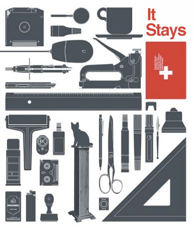
OMD - 宋 / song
项目_ 宋 / song
类型_ 字体、杂志、海报 / 2003


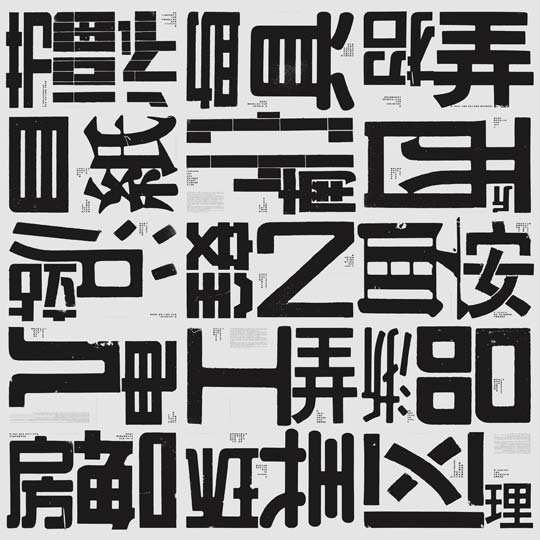
宋 体是一种具有美丽名字的中国字体。宋体横细竖粗,如将细横减去,文字需要辨认,但又可轻易识别。在此展现的是我们进行的宋体研究与其他拓展项目:《浙东文 化》是文博协会的一本杂志,大致是关于文化、考古与博物馆方面的内容。我们创造了这种消失了横划的宋体作为它的品牌,这种新的字体借助于观众的想象空间, 由于格式塔(Gestalt)完形原理,观众在观看时会自己在大脑中去填补其消失的部分。它展示了远古文化的特性,以及考古工作是借助还原与猜测文化的消 失部分的这一特点。其他拓展项目处理方式同理。
摄影:科达
Poster and typeface for “Eastern Zhejiang Culture” magazine. “Eastern Zhejiang Culture” is a magazine of the Culture Relic and Museum Association. Therefore, I created a brand-new typeface by delete the horizontal strokes of the SONGTI. This new font will strengthen the image space for audience. The audience can fill the lack parts of with GESTALT. It show the characteristics of age-old culture and express the speciality of archeology which is engaged in deoxidizing and guessing the part of lost culture.
OMD Contemporary Design Terminal
OMD, a creative team with high innovation spirit, is based on multidiscipline and provides a comprehensive platform for curation, publication, designing and research. It tries all the means to explore more social energy for current designing. Thus initiatively OMD involves itself in many social production scopes, intending to give full rein to designing in every new field and node, meanwhile exploring the meaning of design.
In the field of designing practice, OMD claims to be the collaborator of social production, standing aloof from the traditional handicraft model. Whatever OMD is up to is based on science and reason. It emphasizes a proper designing method and program system, which should be set in accordance with the project itself. Meanwhile OMD is also the creator and explorer of contemporary aesthetics of new design.
Its members’ working backgrounds are set in Europe rather than in China. Before OMD was born, the members once worked independently as designers, writers, researchers, editors, curators, critics or artists, all of whom were rich-experienced in many fields. By now they are still active in the designing area. Their projects have drawn attention and are reported around the world.
In the future OMD will still dedicate itself to the practice, study, promotion and exchange of the designing culture.
Now you know
Knowing is helping.I’d like to think of this as somewhat of a “mini” philosophy that most of us follow unknowingly almost every day. Often, when it comes to issues that are plaguing the world, we simply listen. And although we may feel guilty for not taking immediate action to help fix these issues, we are still helping. The moment you are made aware of an issue, just by listening, you will have already accomplished the first step towards achieving a solution to the problem. After that, it’s entirely up to you to find a solution.
Admittedly, mere awareness, and this website, are not going to save the world. The purpose of this website is not to educate everyone about every single problem that the world is faced with and encourage each person to do their part. We don’t need that kind of pressure. Instead, this can serve as a step towards greater awareness, and in the hopes that those who choose to just know take the next step by spreading the word. Leave your wallet alone and just talk. People will know what to do.
Now you know.
Thanks for helping.
MY MTV: WHERE ARE THEY NOW?
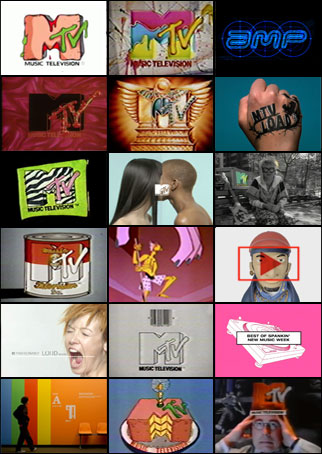
I. WANT. MY. MTV.
…the MTV that was so young it only had a stack of music videos to play, then let a staff of renegades fill in the gaps with animation, art breaks, experimental shorts and ID’s. This combination became the visual and cultural barometer for a generation.
The landscape was new and the only glowing screen in our lives was a television. MTV looked and acted like nothing we’d ever seen before. Because at MTV, people didn’t go to work, they went to play.
We invite you to join us for a night of frolic and folly, looking back at some of those who passed through that playground and where they are now. What it was like to make art for a network that embraced creative exploration before and after our computers took over.
Now dust off those Doc Martins, put your ironic t-shirts on, and come out for a nostalgic night of what was new fueled with work and stories from those who were there, then.
TIME AND PLACE
Thursday 10 June 2010
6:30–8:30PM
Tishman Auditorium
66 West 12th Street
New York, NY 10016
6:30PM Check-in
7:00-8:30PM Event
Kult - Issue 02 - Artificial

Brandon Jan Blommaert
did anyone notice the pussy on the pedestal?
UI Pattern Factory
UI Pattern Factory is a mix of user interface design pattern library and UI gallery. It is a place to find user interface best practices, get design inspiration, and share design solutions with others. Our patterns are always fresh with tons of examples, and you can easily add more using Flickr.
Fumi Mini Nakamura
My name is Fumi Mini Nakamura.
I was born in December 1984 in the small town called Shimizu, Shizuoka, Japan. I grew up surrounded by beautiful mountains and ocean, what childhood it was!
Then I moved to the United States when I was almost twelve years old with my mother and brother. I spent my middle school to college years in beautiful Northern California. Graduated San Jose State University with BFA Pictorial Arts degree in 2007 Fall.
Currently active as freelance illustrator / designer in New York City area.
CAPTCHA Code Art
Are you human? from GDFB.tv on Vimeo.
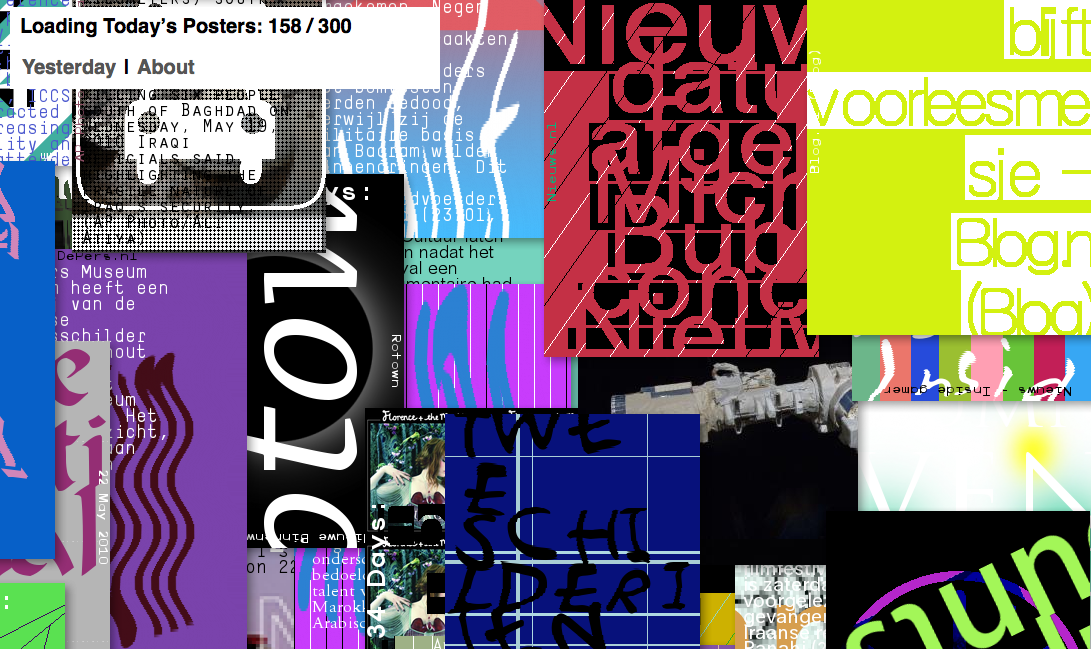
LUST: A Poster Wall for the 21st Century
On the occasion of the opening of the new Graphic Design Museum in Breda (NL) the posterwall for the 21st century was launched, both online and as an installation in the museum itself. In the museum 600 unique posters are automatically generated daily using content gathered from various internet sources. Online, one new poster is generated every five minutes. Constantly new and updated, the posters contain content covering a range of topics such as cultural events, news, weather, etc. In the museum it’s placed at the end of the overview exhibition ‘100 Years of Graphic Design in the Netherlands’. It attempts to provide insight into the direction graphic design might go in the future while posing the question: ‘Do we still need graphic designers?’
http://www.lust.nl/posterwall/
Cultural differences: Japanese box art vs American box art
Some countries just do things better than other countries. America exports films and fast food; France is famous for its wine and snooty red berets; Cuba has cigars and dudes named Castro. And Japan, in addition to many other feats of geek-related awesomeness, can claim the coolest and most creative videogame box art in the world.You’ve seen cover comparisons before, of course, but have you ever wondered exactly what makes the Japanese versions so preferable? Or why gamers are constantly complaining about the mangled translations? We did, and after scouring through hundreds of examples, we discovered these nine undeniable trends.

Game covers are usually pretty predictable. Is it a shooting game? Put a gun on the front! Is it a cartoon action game? Make sure to include a wacky animal with saucer-sized eyes! How about a kids’ game? Eh, just throw together a bunch of shiny, candy colors.
In Japan, they take chances. Strange and wonderful chances. The kids’ title is marketed with images of healthy food and kitchen utensils. The cartoon actioner gets a photo of a foot. Yes, a foot. The shooter is sold with nothing more than a naked man, curled into a decidedly un-badass position.
Ironically, these bizarre scenes are actually much more accurate to the game experience than their Western counterparts.


Guess what? Having fun is not necessarily a bad thing. Being happy is sometimes rather pleasant, really. Japanese developers understand this mysterious truth, but while they keep trying to export their eternally sunny characters to us, we just keep transforming them into gloomy, moody tough guys. And when we send over our own short-tempered mascots, they’re forced to give them a makeover, lest our incessant misery rub off on any innocent Japanese children.


![]()
Hmm. In this case, we’ll take the adorable Pikmin family, posing and waving, over the terrifying taxidermal lineup on the Japanese cover.
![]()

Ah, the disembodied head. So helpful. So necessary! Without those inexplicably hovering faces, how would we ever know whether the game has characters or not? Without that eye contact, how would we ever be convinced to buy?
Japanese box art assumes that things like lightsabers, spaceships, fighter planes and school girls will be enough. How naïve.


![]()
Eternal Sonata or Trusty Bell: Chopin’s Dream? You have to admire that direct of a title, but points off for the lazy, probably last-minute addition of a drifting cloud head. Hey everyone, there’s a girl in here!
![]()


Okay, you’d think this would be simple. If you’ve got a game about dragons, you put friggin’ dragons on the cover. Zombies? Zombies! Superheroes? Superheroes!
If you’ve got a game featuring both fantasy adventure and knockoff Bejeweled gameplay, you highlight the former and not the latter. If you’ve got a game about sweaty, shirtless men wrestling in their backyards, you lie and put a picture of half naked women on the front. Simple, see?


![]()
Whatever the hell your game is about, do not emphasize two balding middle-aged men on the box. If you must, at least don’t force us to stare into the depths of every scar and wrinkle. Yuck.
![]()

from http://www.gamesradar.com/f/why-japanese-box-art-is-better/a-20080729123833874037
The Institute of Social Hypocrisy
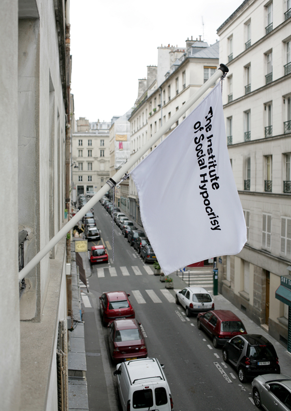
The Institute of Social Hypocrisy is an artificial organization that fronts an artist-led project, run by the artist Victor Boullet in the centre of Paris. The ISH is conducted in the form of a protracted performance piece and its very existence is brought about by inviting collaboration with other participants.
Each player and event contributes vital information and connections that allow the Institute to progress.
The ISH provides a perception of authority and thus acts as a Trojan horse; it permits the contributors to covertly infiltrate organizations and to gain access people that they might not normally be able to approach.
The accepted paraphernalia that symbolize an official structure also represent The Institute. Door plaques, headed paper, business cards and a flag combine to present an authoritative façade that conceals the true internal activity.
The fundamental theme recurring in Victor Boullet’s work is that of alienation and acceptance. He highlights the aspects of intrinsically hypocritical social behaviour used to ingratiate oneself with others. This sense of exclusion, and the subsequent desire to put up an illusion of conformity, functions as the point of departure for the activities taking place within the ISH.
The Institute combines these two connected aspects, of simulated bureaucracy and hypocrisy to form a conceptual umbrella under which a programme of related events can take place. It provides a structure for artists to take control of the programming and direction of their work and to be responsible for the events, installations and publications that will culminate in the creation of the history of The Institute of Social Hypocrisy.
Super Sexy CPR
Super Sexy CPR from Super Sexy CPR on Vimeo.
Elliot Schrage, vice president for public policy at Facebook, responded to questions from concerned users about recent changes to Facebook’s privacy settings in a post at The New York Times.Privacy advocates and members of the technology media have been fiercely critical of Facebook’s latest changes, which make all users’ interests public. Elliot answered a range of questions on the issue, but his response boils down to the following:
- Facebook is very sorry that the changes confused people, and it will do a better job ensuring that its privacy settings are more transparent in the future.
- Facebook is not at all sorry about the substance of the changes. No one is being forced to join Facebook, and no one who does join is being forced to list their interests. “If you’re not comfortable sharing, don’t.”
Elliot never gives a convincing explanation for why the option to keep interests private was removed, so his responses are unlikely to satisfy many of Facebook’s critics. But so far, there isn’t any indication that more than a handful of Facebook’s 400 million users care.
Facebook and its privacy problems
Facebook CEO Mark Zuckerberg and his company are suddenly facing a big new round of scrutiny and criticism about their cavalier attitude toward user privacy.An early instant messenger exchange Mark had with a college friend won’t help put these concerns to rest.
According to SAI sources, the following exchange is between a 19-year-old Mark Zuckerberg and a friend shortly after Mark launched The Facebook in his dorm room:
Zuck: Yeah so if you ever need info about anyone at Harvard
Zuck: Just ask.
Zuck: I have over 4,000 emails, pictures, addresses, SNS
[Redacted Friend’s Name]: What? How’d you manage that one?
Zuck: People just submitted it.
Zuck: I don’t know why.
Zuck: They “trust me”
Zuck: Dumb fucks.
Brutal.
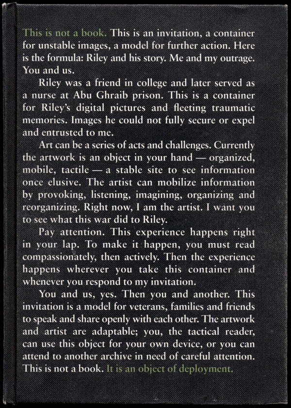
Riley and his story

http://www.rileyandhisstory.com/
Riley and his story. is the result of a collaboration Monica Haller initiated with Iraq war veteran, Riley Sharbonno. It combines text from their conversations over three years with his images from combat.
Here, the camera is a prosthetic devise. It serves as a witness to events that make us want to turn away. We begin with images rejected or repressed in the consciousness of Riley Sharbonno, an Iraq War combat veteran.
Riley has pictures that he doesn’t remember taking, nor does he remember the event itself. Riley looks at these images upon his return home, as if for the first time. He looks at them for the first time along side us, other U.S. citizens; how does that implicate us as witnesses?
Digital data storage holds evidence of the past for possible future recognition. Here we are now. What stories do we tell ourselves, our families, our friends?
The digital archive picturing the Iraq War is ever expanding. Official network media and user generated websites are “refreshed” daily. The ever-expanding archive is ubiquitous and ephemeral. It is also evasive; massive amounts of unedited digital information make it hard to access. Pause to make meaning. Confront this archive, your archive. Manage a narrative that makes sense.
This project is about what a book is, what reading is, what interacting with images is. How a book is deployed, disseminated, and staged all change the way it is used. Evolving technologies, or redeploying of old technologies, changes the way information is received.
What does it mean to offer this digital archive between the two covers of a book? Will the reader focus? Turn off her cell phone? Pay close attention? How does a stable, physical object both limit and liberate actual human experience?
Can such a book mobilize a reader? Can that reader move another reader?
Published by onestar press and Fälth & Hässler
WOOG Interview @ Zoom Magazine
Woog is an art director, designer, typographer, illustrator and artist. Born in Hong Kong, Woog, a.k.a Woo Kung Tai Gino, grew up in the New Romantic 80’s aspiring to be a DJ, but became a graphic painter instead. Half way out of his DJ closet, these days he mostly scratches with his pencil, painting with type and creating orgasmic images that draw from his heritage, identity and memory. He is currently working at Wieden+Kennedy Shanghai.
Recognition includes Cannes Cyber Lion, AIGA, ADC NY, American Illustration, ONE Show gold and silver, D+AD, RESFEST, and ONEDOTZERO.
Prior to W+K Shanghai, he worked at W+K Tokyo, Imaginary Forces, Paul Mcmenamin / v23, Neville Brody’s Research Studios and taught at Temple University / Tyler School of Art. He received his BFA in Graphic Design at Art Center College of Design.
http://www.zoommag.jp/zoom03.html
http://www.zoommag.jp/zoom03/index_en.html
Project M in Germany

1. Your name
2. Your phone number
3. A link to your website
4. A link to your video
Don’t forget: Your video should be no longer than
60 seconds and should look nothing like the ones you’ve just seen. Make it legendary.
Project M is a program for young creative people who are already inspired to contribute to the greater good, and are looking for a platform to collaborate and generate ideas and projects bigger then themselves. Project M is that platform.
Project M will encourage and provide techniques for thinking wrong as a way to generate new ideas and design directions. The human brain tends to think along predetermined linear thought pathways. Such linear thinking can inhibit true innovation and creative exploration.
Project M is not a school and has no tuition. Every attending person will share the expenses of funding Project M. The expenses will be $2000 each. Some M’ers have been very creative about raising this amount. You should be too.
Applications are due on July 15th, 2010.
More detailed logistics and procedures to follow upon acceptance. Questions? Call, write or email.
e: john@c2llc.com // p: 207.323.0792 //
25 Congress Street // Belfast, ME 04915
Copyright © _dreams. All rights reserved.